
“The activity of painting: A thrilling tussle between the artist’s materials and his inspiration.”
For those of us who are tempted by positively everything within an art store, investing in a new medium can be a daunting task ( of trying not to buy everything - and still keeping within the budget). As with Acrylic, I would strongly recommend walking past all super cheap brands of oil paint - the price difference is not worth the lack in quality. My go-to brands are Winsor and Newton and Daler Rowney Georgian. I also use a few tubes of Lucas Studio which I find to be very handy within my studio.
(PS: Don't be shy to discreetly open up a few tubes of paint in store to compare quality and colour differences -just don't squeeze and make a mess!)
1. The Double Primaries

Daler Rowney | Georgian: Lemon Yellow, Cadmium Yellow, Cadmium Red, Crimson Alizarin, Cobalt Blue, French Ultramarine
2. EARTH COLOURS
Apart from the primary doubles, when painting with Oil, it is absolutely necessary to have a good set of earth colours. These lend qualities of warmth and depth to an oil painting - especially when used in layering. The first 5 colours in this photo are essential, the other 3 for the next time you can buy more paint.

Winsor and Newton: Burnt Sienna, Raw Sienna, Burnt Umber, Raw Umber, Ivory Black | Extra: Payne's Grey, Yellow Ochre (Transparent), Vandyke Brown
Sap Green and Cadmium Orange are nice extras to have when your budget allows.
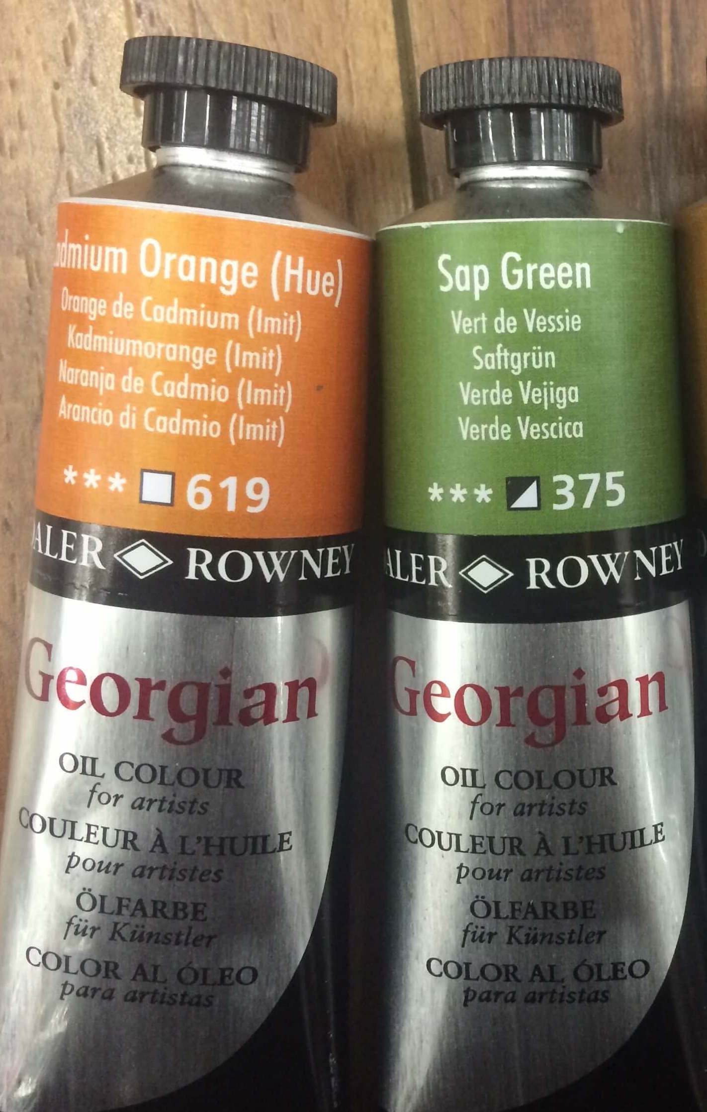
Daler Rowney | Georgian: Cadmium Orange (Hue), Sap Green
3. Whites and Lights
These are a few of the Lucas Studio paints I find very useful in my studio. White is, obviously, always necessary and once again - the larger the better. The other light colours within this collection are great for mixing in with white, or other colours - for when you want to lighten things up. Indigo, on the other hand, is one of my favourite colours, and a painting hardly leaves my studio without it!

Lucas Studio: Titanium White, Beige, Flesh Colour, Sky Blue, Indigo
4. Extra: if you still feel under-indulged, these are my suggestions for Building up your palette.
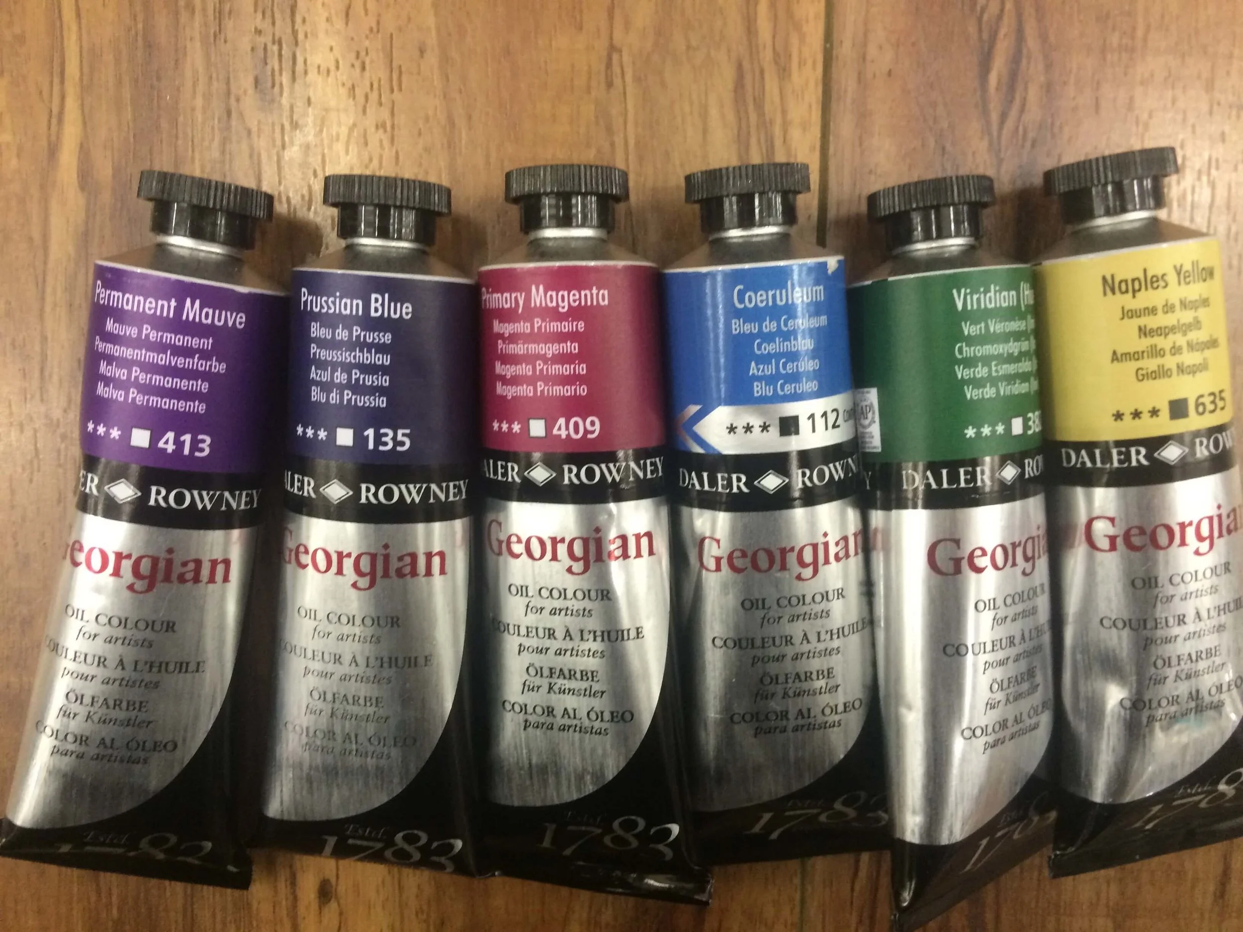
Daler Rowney | Georgian; Permanent Mauve, Prussian Blue, Primary Magenta, Coeruleum, Viridian (Hue), Naples Yellow