
Take the time to know your gear.
If you are a beginner, look at the names of the colours you use and start calling each colour by name. Most people have poor colour memory, but once you attach a name to a specific colour, it becomes easier to recognise and recall.
An artist should be "paint literate" in terms of not only being able to recall paint by its name but also understanding the ingredients used and the differences between each. Like good quality food, good quality paint manufacturers show you what you are buying, because they are proud of their product. Therefore, familiarise yourself with ingredient names. If paint tubes don't mention exactly what was used in the making of the paint, don't buy them! If they use too many ingredients, it's also fishy!
The information on these labels helps you to make better choices. Though names of colours may differ between ranges and manufacturers, the pigment content is the ideal way of knowing what you are buying. This is a colour’s C.I. Name (Colour Index Name).
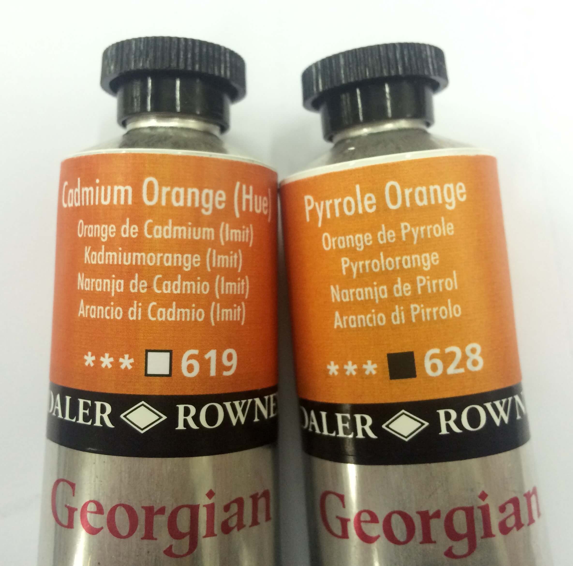
![These two paints, Cadmium Orange (Hue) {Above], and Pyrrole Orange {Below}, appear to be the exact same colour. However, as a result of the different ingredients used, these two colours greatly vary in how transparent they are.](https://images.squarespace-cdn.com/content/v1/561171f3e4b01402b908a5c6/1473062468057-A8EPHFH8WXUXO3XU4QJU/Colour_Transparency_Ingredients)
These two paints, Cadmium Orange (Hue) {Above], and Pyrrole Orange {Below}, appear to be the exact same colour. However, as a result of the different ingredients used, these two colours greatly vary in how transparent they are.
When deciding on a specific colour to use it is important to consider the transparency/ opaqueness of the particular hue. The symbol used to show the transparency of a paint is an empty square while a coloured-in square is used to show opaqueness. A line crossing the square diagonally or half coloured -in, shows that the paint is between opaque and transparent.
For example, when glazing, use transparent raw sienna - but when mixing solid colour fields, use semi-opaque yellow ochre (see below). By layering pure transparent colours, without mixing them on a palette, great depth can be produced. One of the tricks of the 'old masters' was to paint shadowy areas in transparent colours and the highlight focus areas with opaque colours.
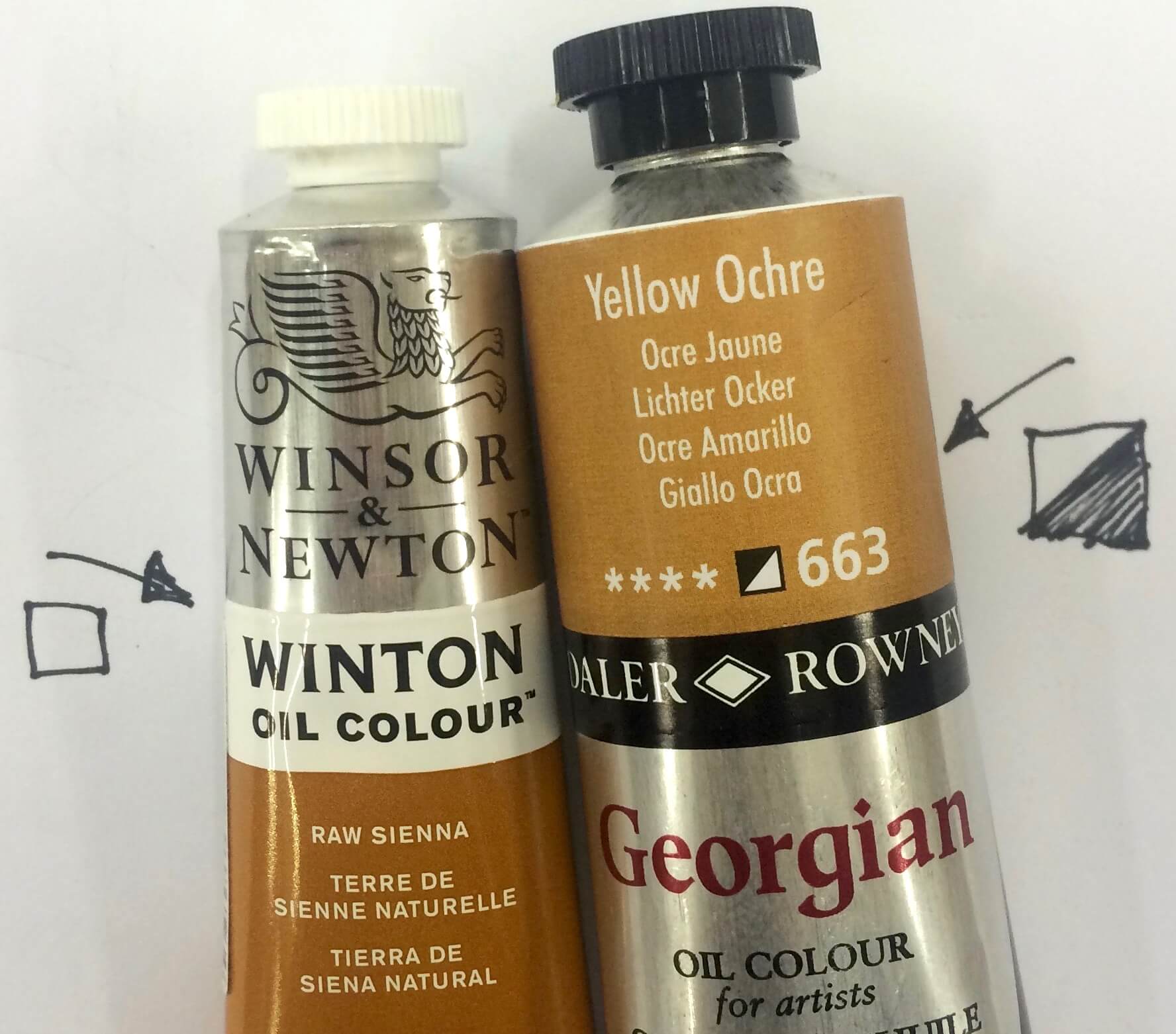
On each tube of quality paint you will find a little square, this square indicates the level of transparency of the paint. This square will either be black - opaque, white - transparent or, black and white - semi transparent.
Oil paint has a long history of containing hazardous elements (e.g Flake White which contains lead and Cadmium which is considered poisonous). Solvents like turpentine can lead to chemical pneumonia amongst other issues, and Linseed oil is highly flammable. Consider this when painting (once again you need to know your pigments) and do not inhale or let paint and solvents touch open wounds. A practical approach is to keep plants in your art studio that purify the air (Google NASA air purifying plants for more information on this).
A colour’s permanence is its lightfastness (how resistant it is to fading). Good manufactures don't waste their time with weak pigments, so stick with them and then you don't ever have to worry about the lightfast rating of your pigments! Unlike painters of previous centuries we are lucky enough to have many permanent colours manufactured today.
The staining ability of a colour is only relevant in watercolour and is shown by the symbol 'S'. This attribute affects how one can soften and even lift colours from the paper as one is developing the work. However, colours that stain the surface will never be totally lifted. An example is Alizarin Crimson. This can be a pro or a con, depending on what you're trying to achieve.
GENERAL COLOUR JARGON
When speaking about colours it helps to understand certain terms:
- A paint’s:
Hue = its colour e.g. blue ( when a tube of paint is called 'cadmium hue', that means it is a copy of the colour cadmium but not using the actual cadmium ingredient, similarly, 'flake white hue' is not real lead but a mix of titanium and zinc thats as close to the real things as possible but not poisonous! )
Tint = Hue + white
Tone = Hue + grey
Shade = Hue + black
Undertone: Thin film of colour (as opposed to mass tone when seen in thick layers straight from tube)
- Colour temperature (warmer or cooler) speaks of the amount of blue contained in the colour.
- A colour’s bias represents its leaning towards another colour. A red can lean toward blue or purple, depending on the pigments used in its creation. What does your picture need?
- A colour’s value sites its lightness or darkness and scientifically it means the extent to which it reflects or absorbs light. In practical terms this is important as you would use this to plan around your focal point. The higher the value, the more dominant a colour’s role.
- A colour’s chroma (intensity) talks of its brightness. This can be changed by adding the colours complement. Adding more and more will let it turn into neutral colours like browns and greys.
- When a colour has high tinting strength it will be dominant in any mixture that you attempt with it e.g. Winsor Blue. Remember that the quality of the manufacturing (to be seen in the price range, will also have an effect here)
The more we know and understand, the better we can prepare and create.
Happy painting !