
Using colours effectively can lift a mediocre painting to new heights.
Because colour is relative and strongly influenced by its surroundings, you need to learn which colours work most effectively next to each other. For this reason I encourage everyone in do this excercise at least once:
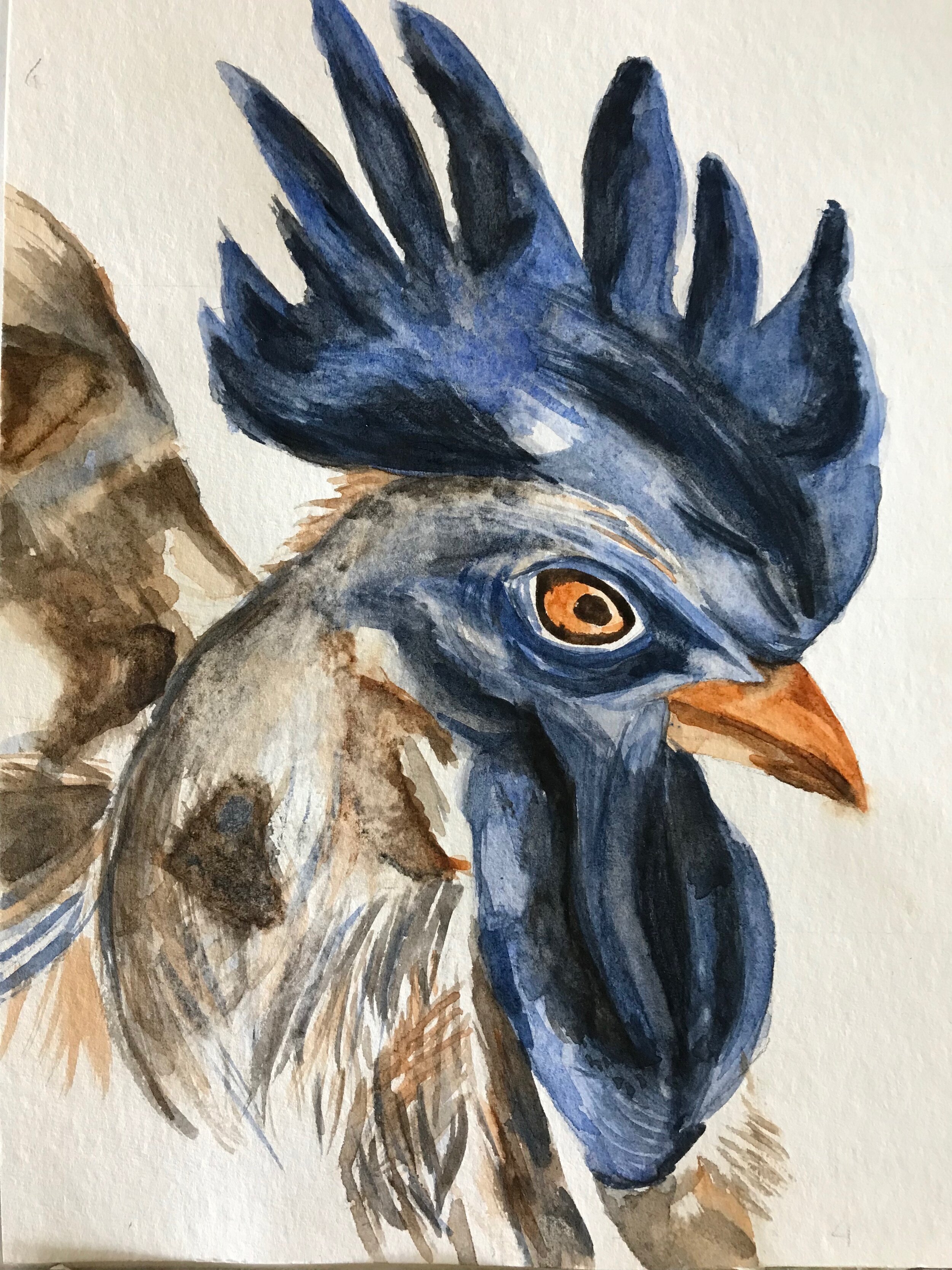
Plan a theme and make four small paintings using only
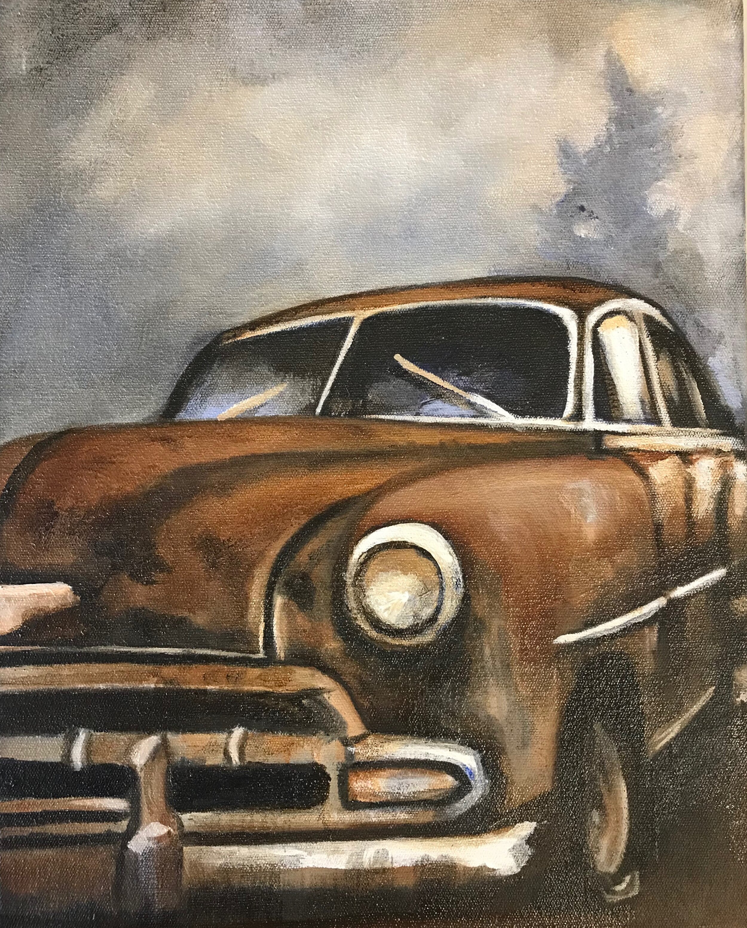
burnt sienna + ultra marine+ white
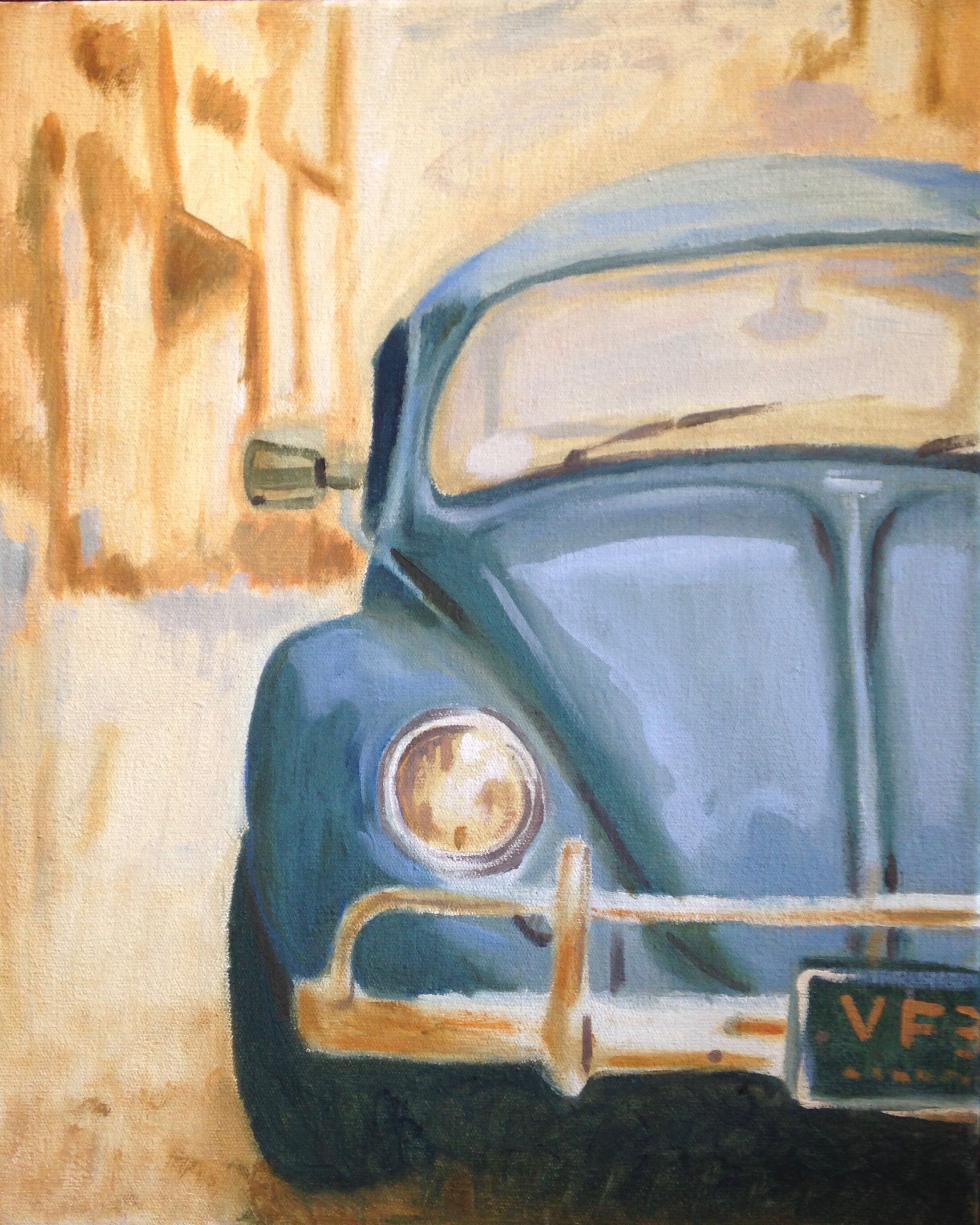
orange + any two blues +white (eg. cadmium orange + ultra marine+ cerulean blue )
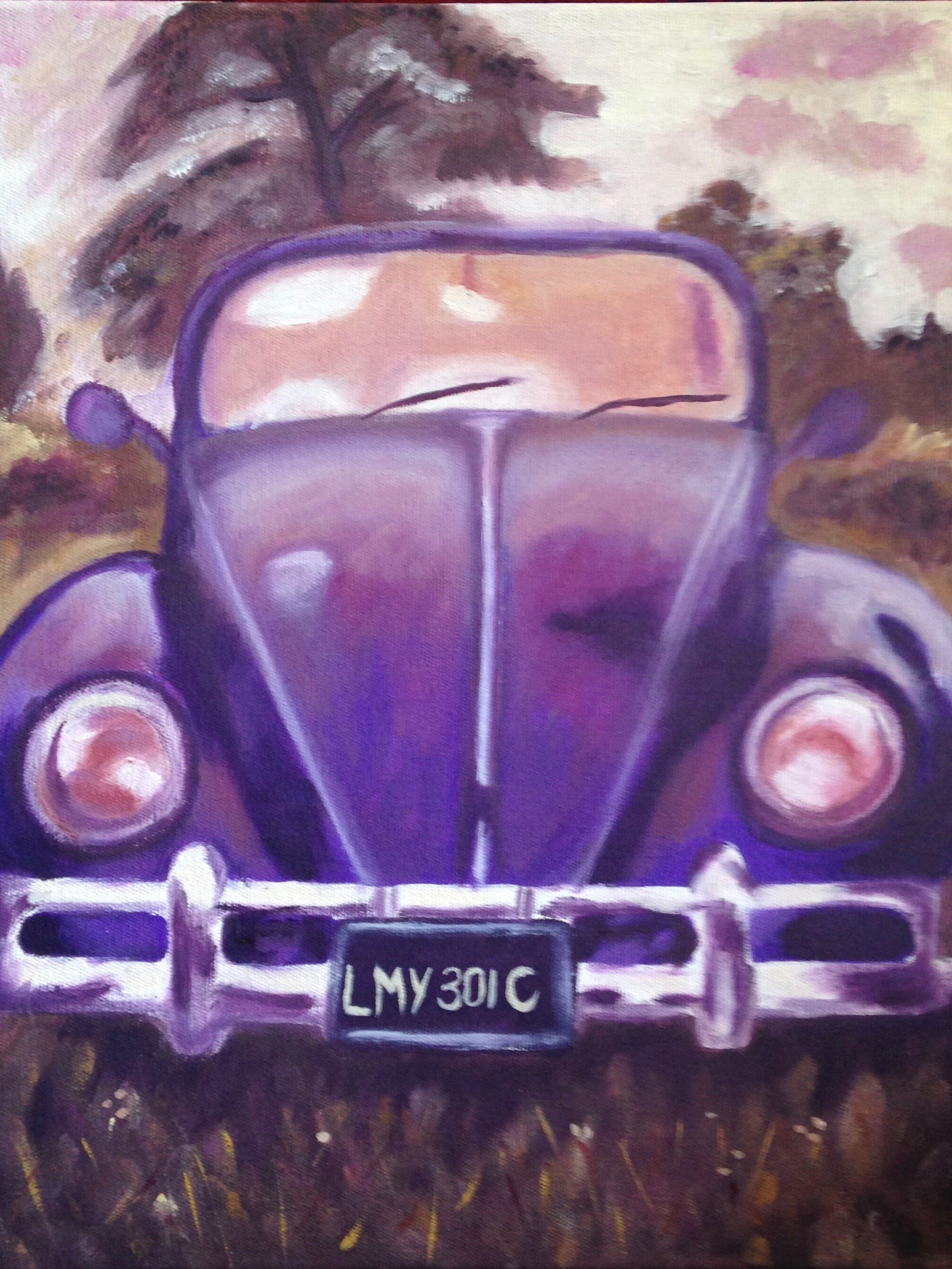
purple + yellow +white ( eg. yellow ochre + cadmium yellow+ deep purple) or ( yellow ochre + magenta + deep purple )
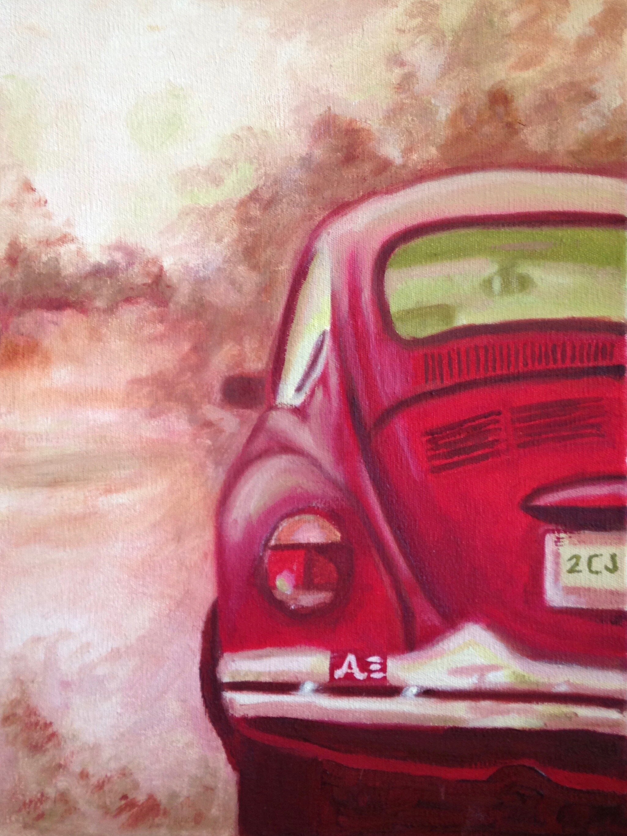
red + green+ white (eg. alizarin red + cadmium red + sap green) or (sap green +viridian green + cadmium red)
It’s important to not to use two reds and two greens because then you’ve got the whole colour spectrum again and you’ll cheat! ( there is an example of a cheat painting at the end of this blog post) . If you’re tempted to sneak in a black, don’t, it will scream like a false note in a perfect choir!
The aim of this exercise is to start seeing colour harmony. Think not in terms of tubes of paint , but
‘warm’ vs ‘cool’
‘light’ vs ‘dark’
‘saturated colour’ vs ‘ muted colour’.
So a quick run through of colour basics: ( For more information on Primary Colours, and the explanation of Double Primary Colours, click here.)
Red, Yellow and Blue form the Primary Colours. Primary Colours can not be mixed from other colours. Secondary colours are Orange, Green and Purple. These are made by combining the primary colours. Colours that are opposite from each other can also be named complementary colours. The primary colours are "in love" with the secondary colour opposite to them on the colour wheel.
We now have six colour groups which form the general basis of our colour wheel. Each colour has a neighbour, and each has an opposite.
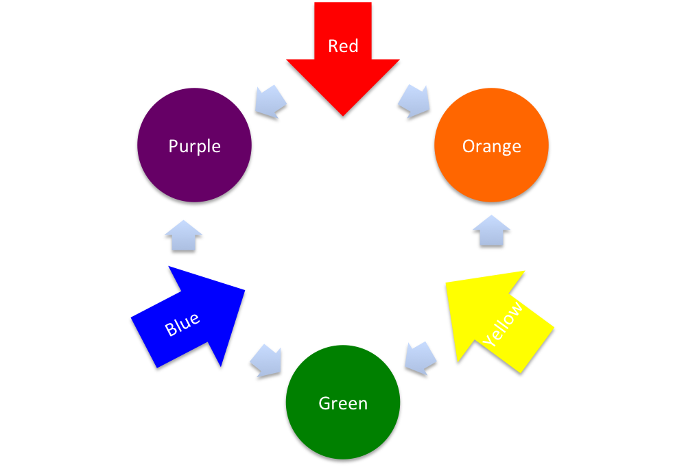
From the above wheel you will see that:
- Red is neighbours with Orange and Purple, and opposite of Green.
- Yellow is neighbours with Orange and Green, and opposite of Purple
- Blue is neighbours with Green and Purple, and opposite of Orange

These lovely examples done by former student, Gerrie Knipe, and show how effectively complementary colours work together: each panting was only painted with the different complementary pairs and white!!
On using complementary colours:
- Due to the vivid contrast between the colours, two complementary colours will activate each other on a canvas. This can even go as far as creating a shimmering effect
- By using a objects colour’s complement in its shading, the object will be highlighted as its colour is pushed to the limit ( eg: When painting a red apple, use green in the shadow.)
Colour Schemes
-Using complementary colours side by side is a dynamic way of creating a focus point
-Using neighbour colours (Analogous) will ensure harmony in your work
- When mixing together complementary colours, a wide range of greys – and also developing from this: browns – can be created. Mix in white to create a neutral beige.
Click here, to see how the Impressionists used complementary colours effectively.
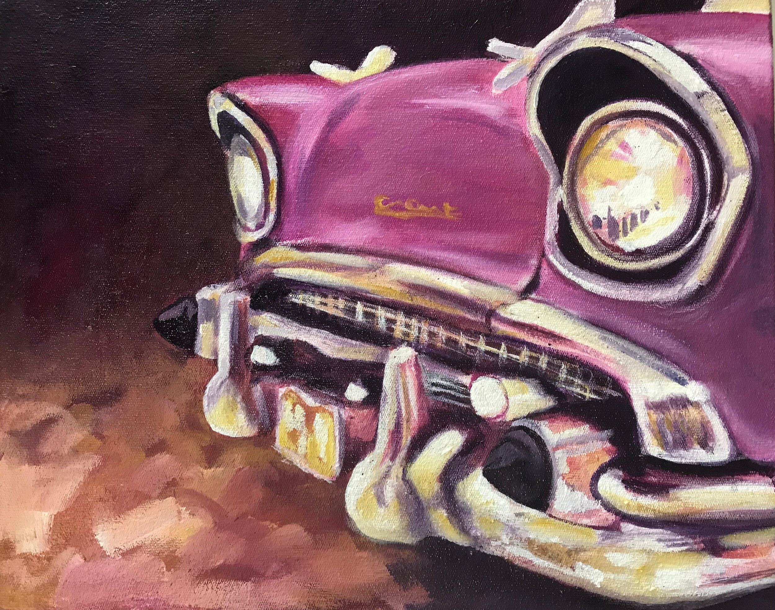
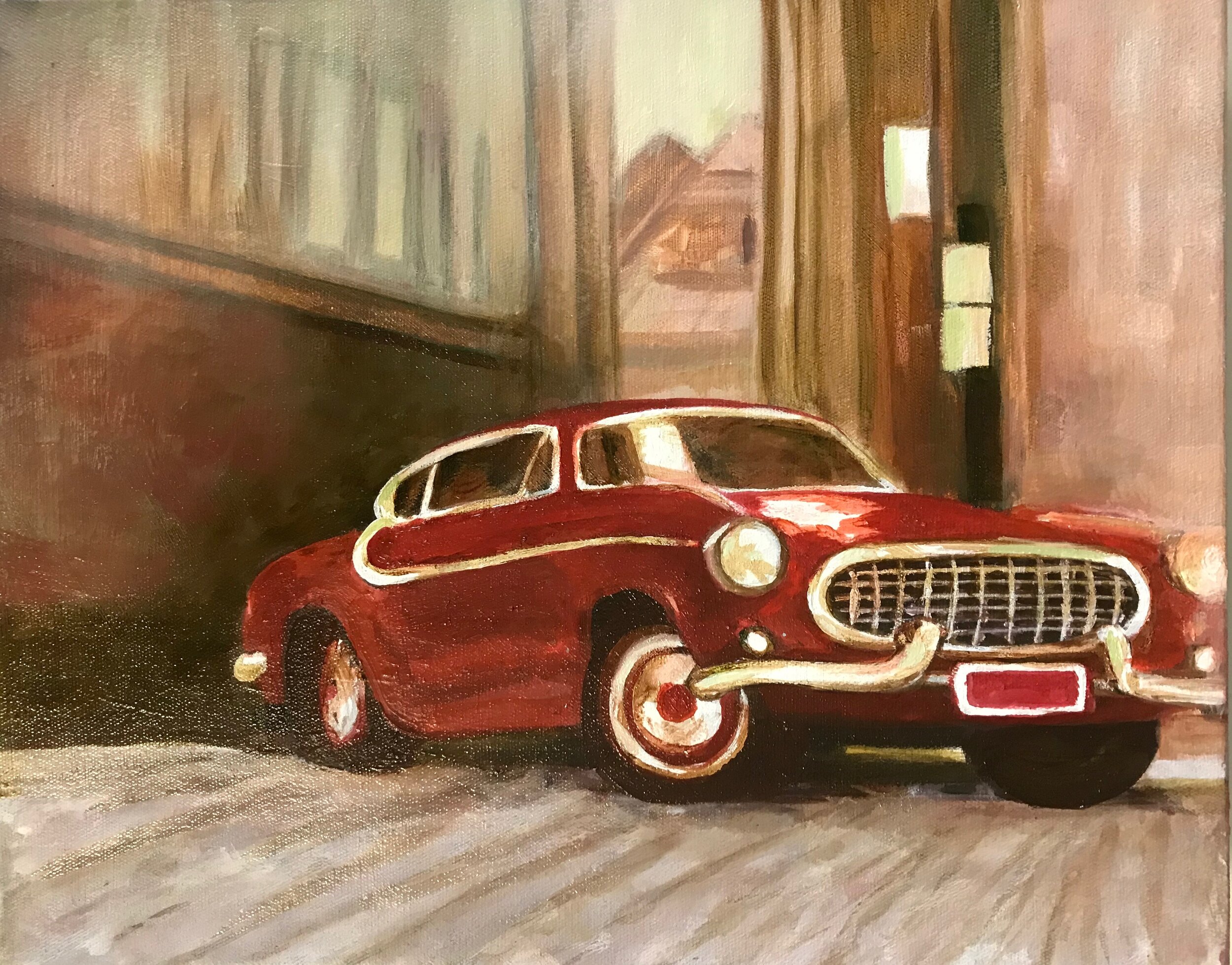
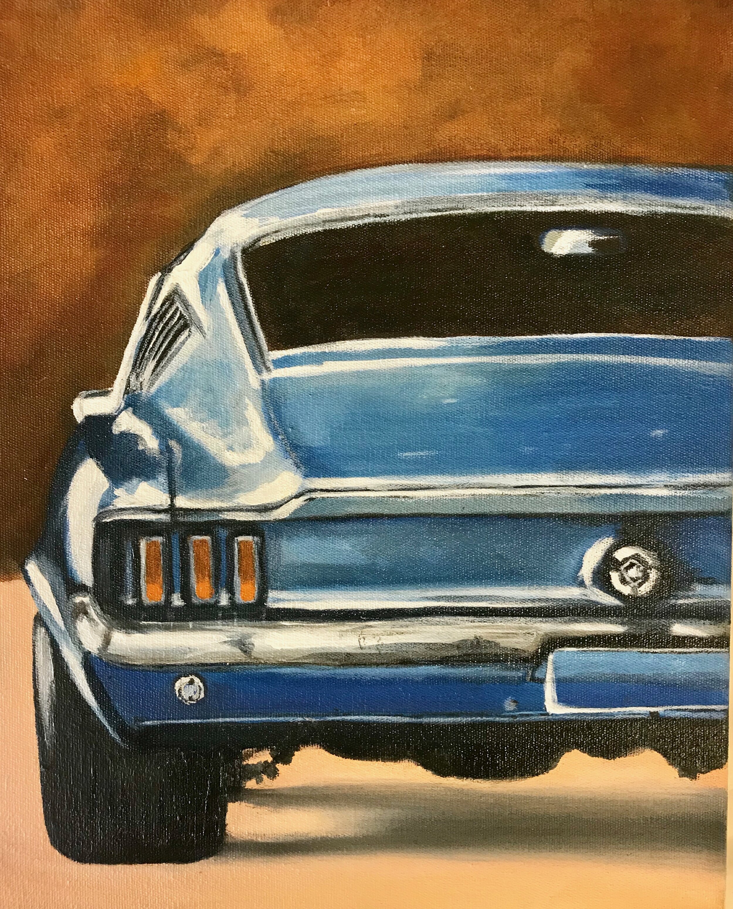
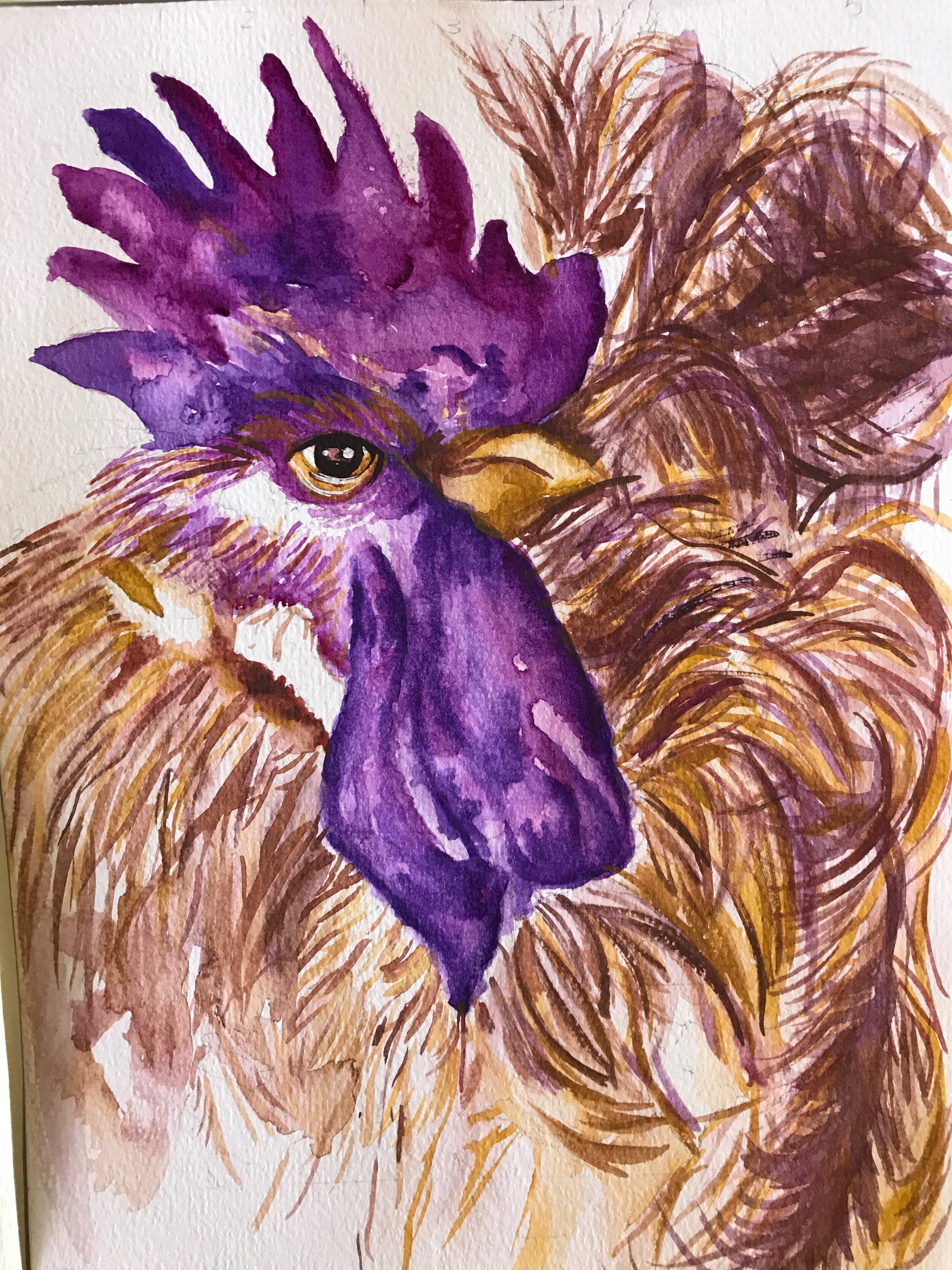
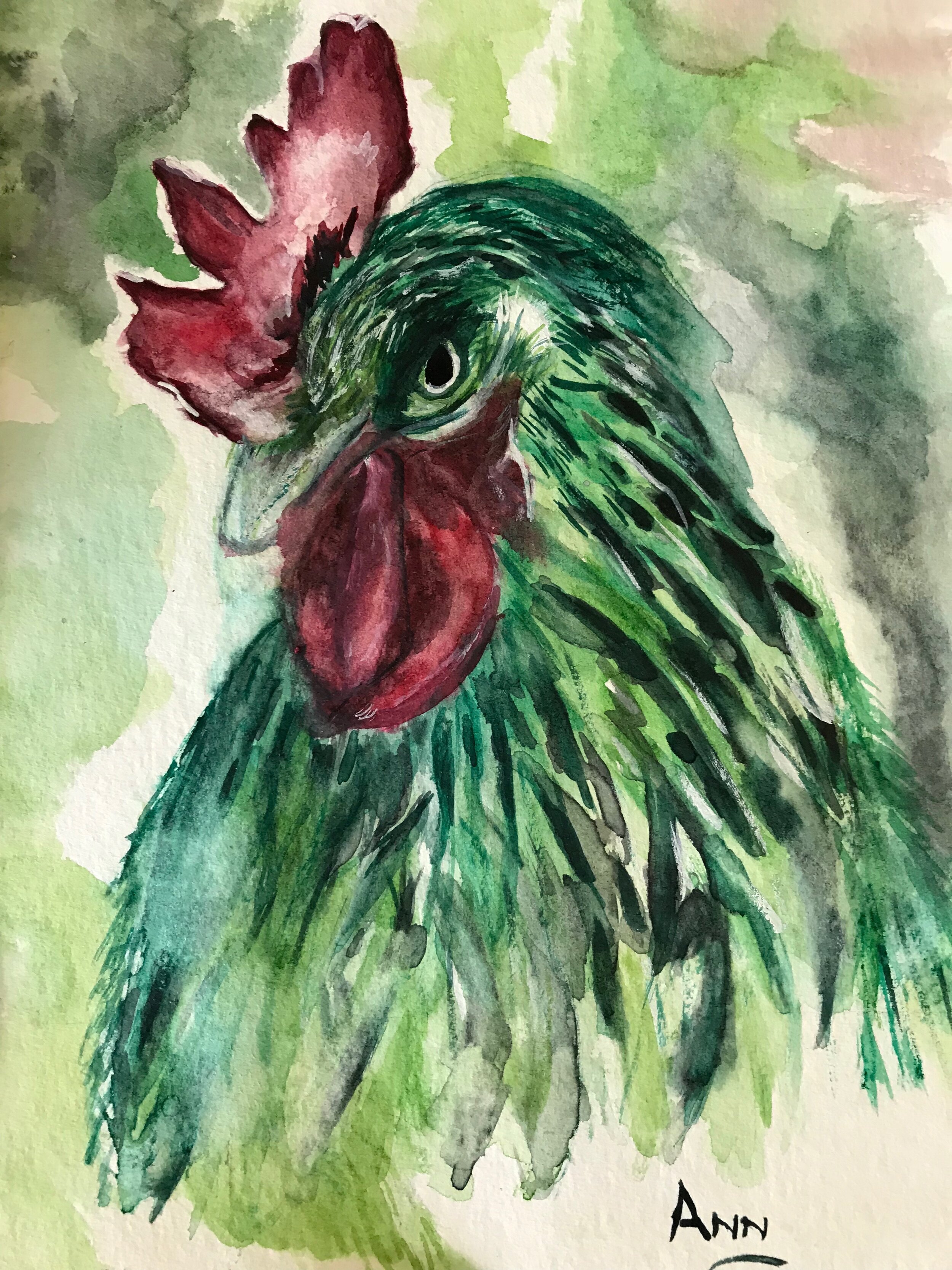
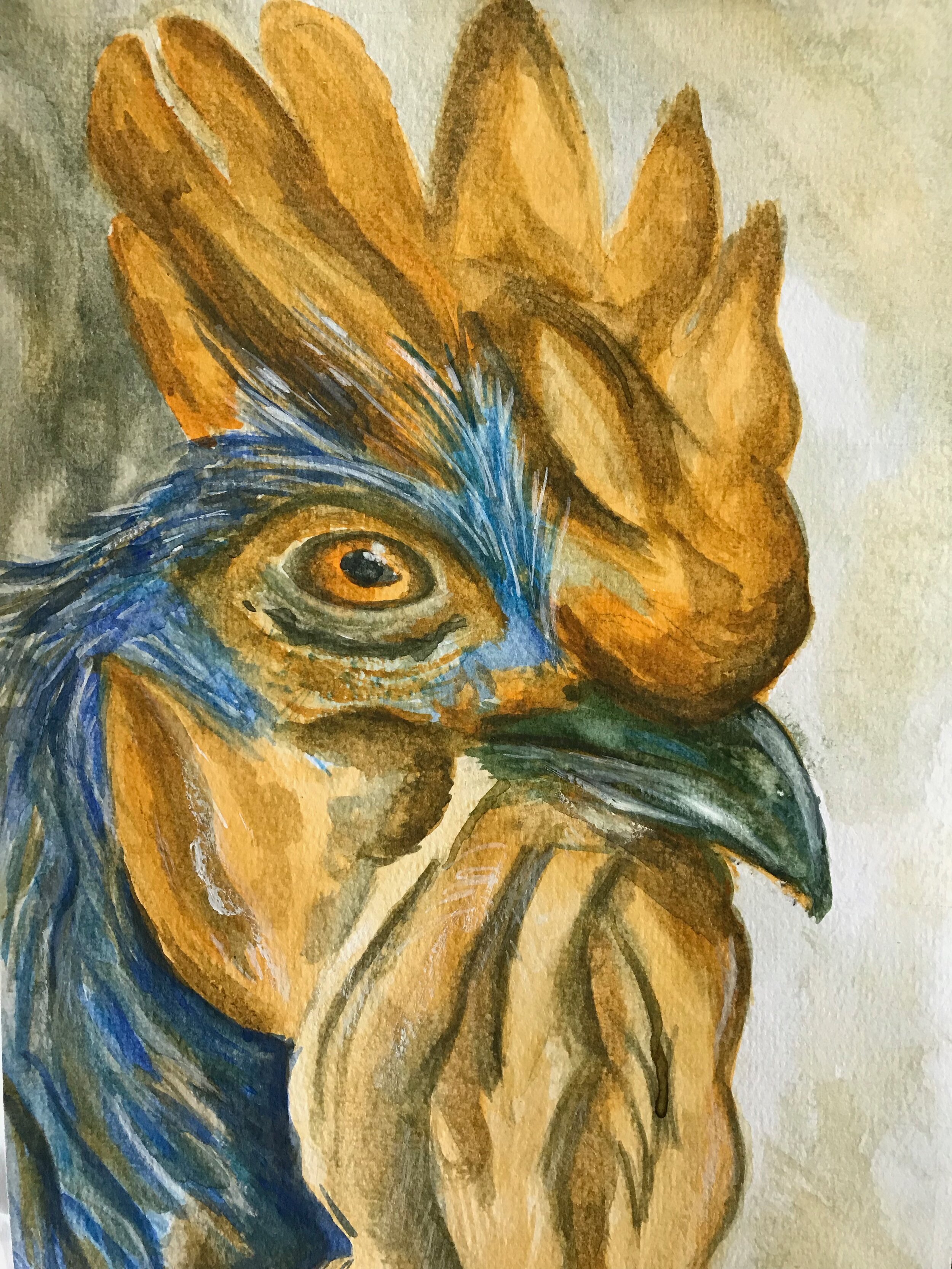
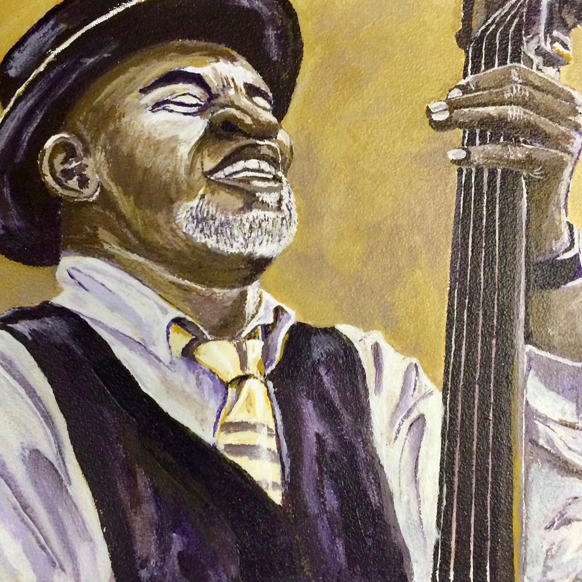
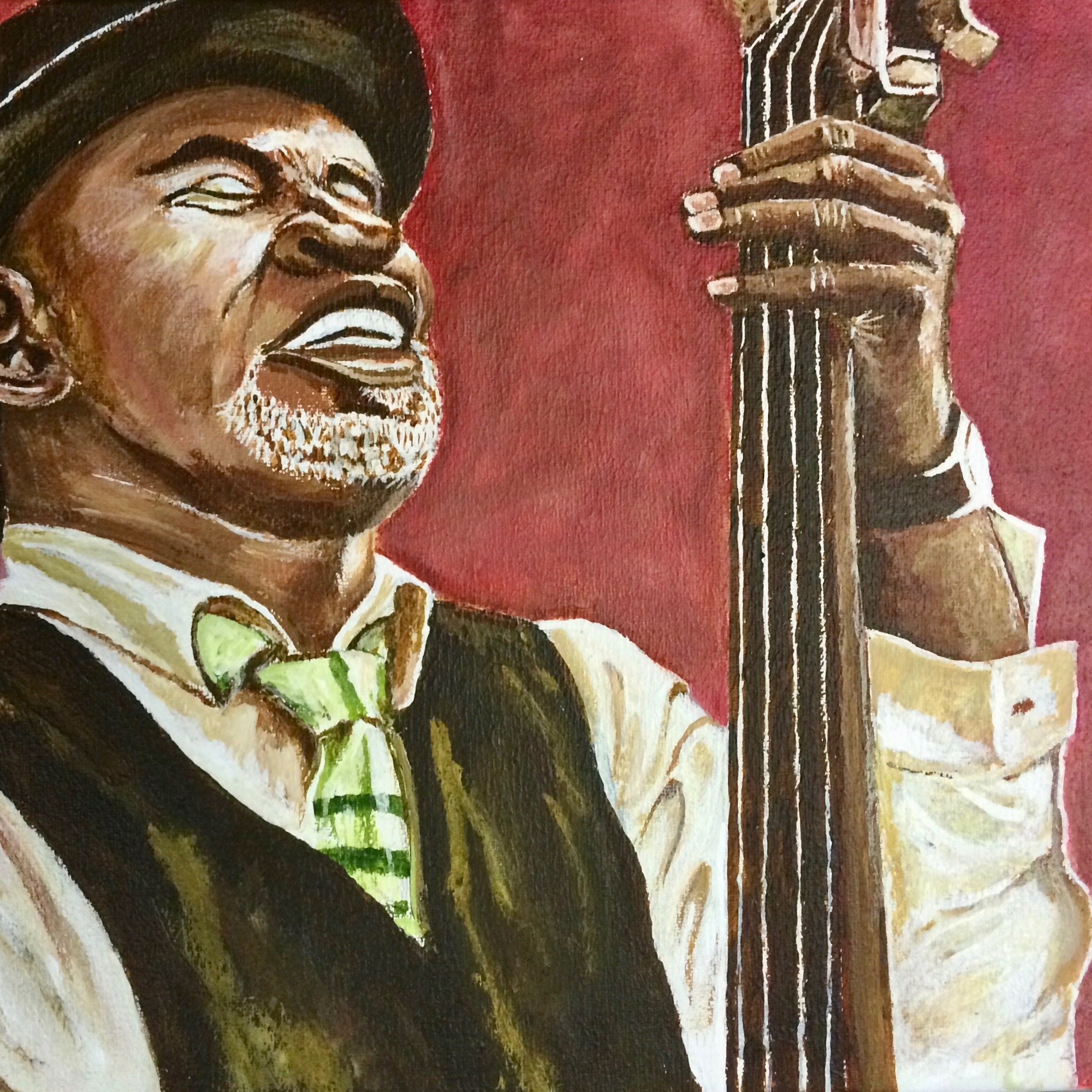
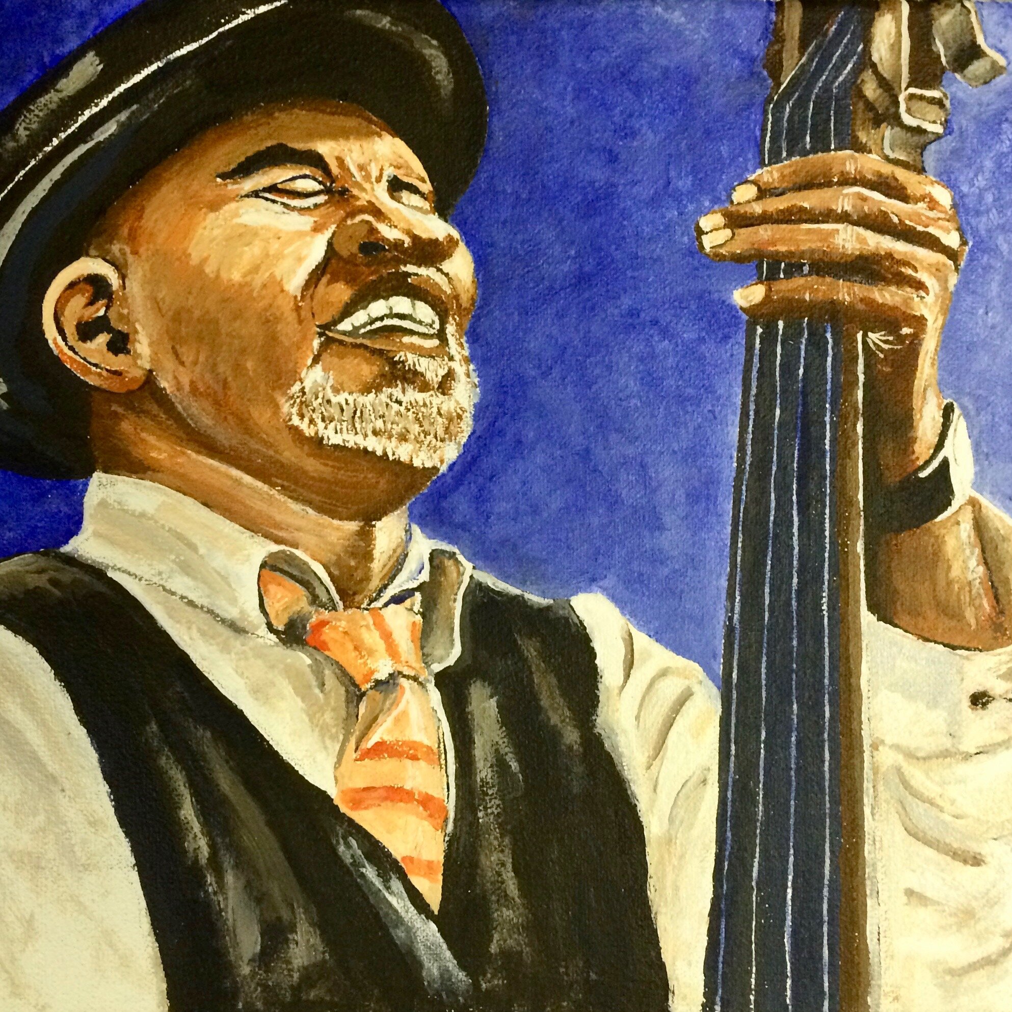
Here are examples from some of my students, Elmarie, Tersia, Wilni, Rina, Ann and Andy. It is important to note that complementary colours stay effective even when you are using different shades of the primary /secondary colours. The first column depicts shades of purple and yellow, the second column red and green, then blue and orange, and the last column is an added exercise in ‘Old Master Winning Recipe’ of Ultramine Blue and Burnt Sienna (which is in fact an earthy complementary mix of blue and orange! Thats why they look so similar on this chart)
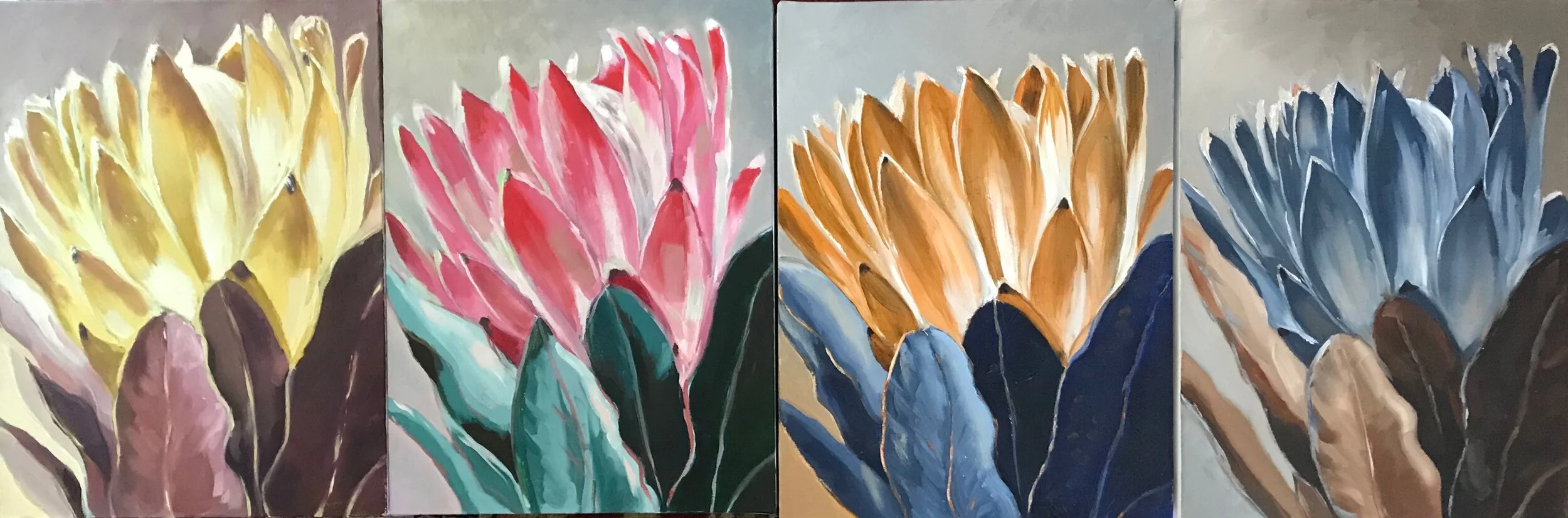

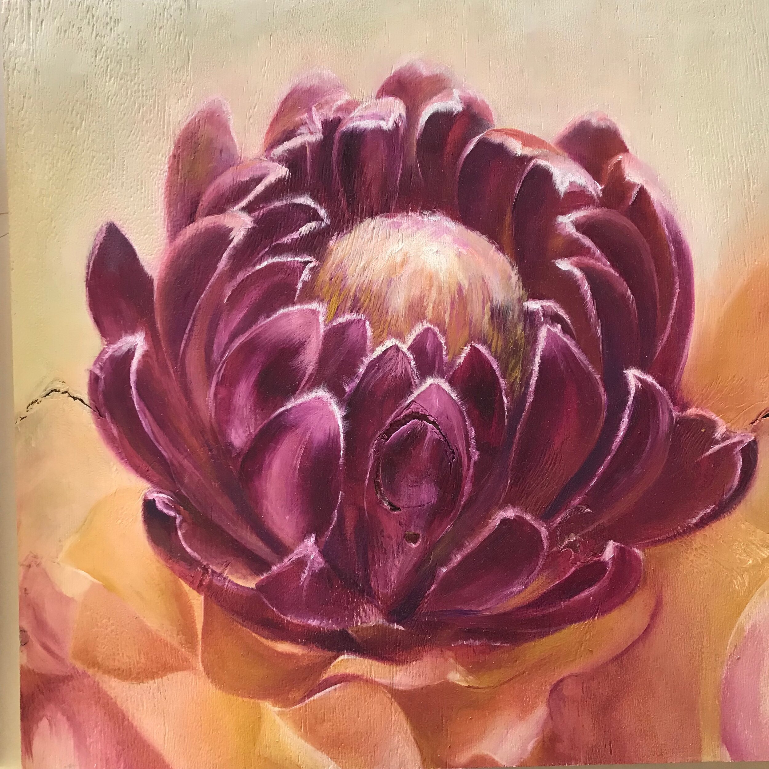
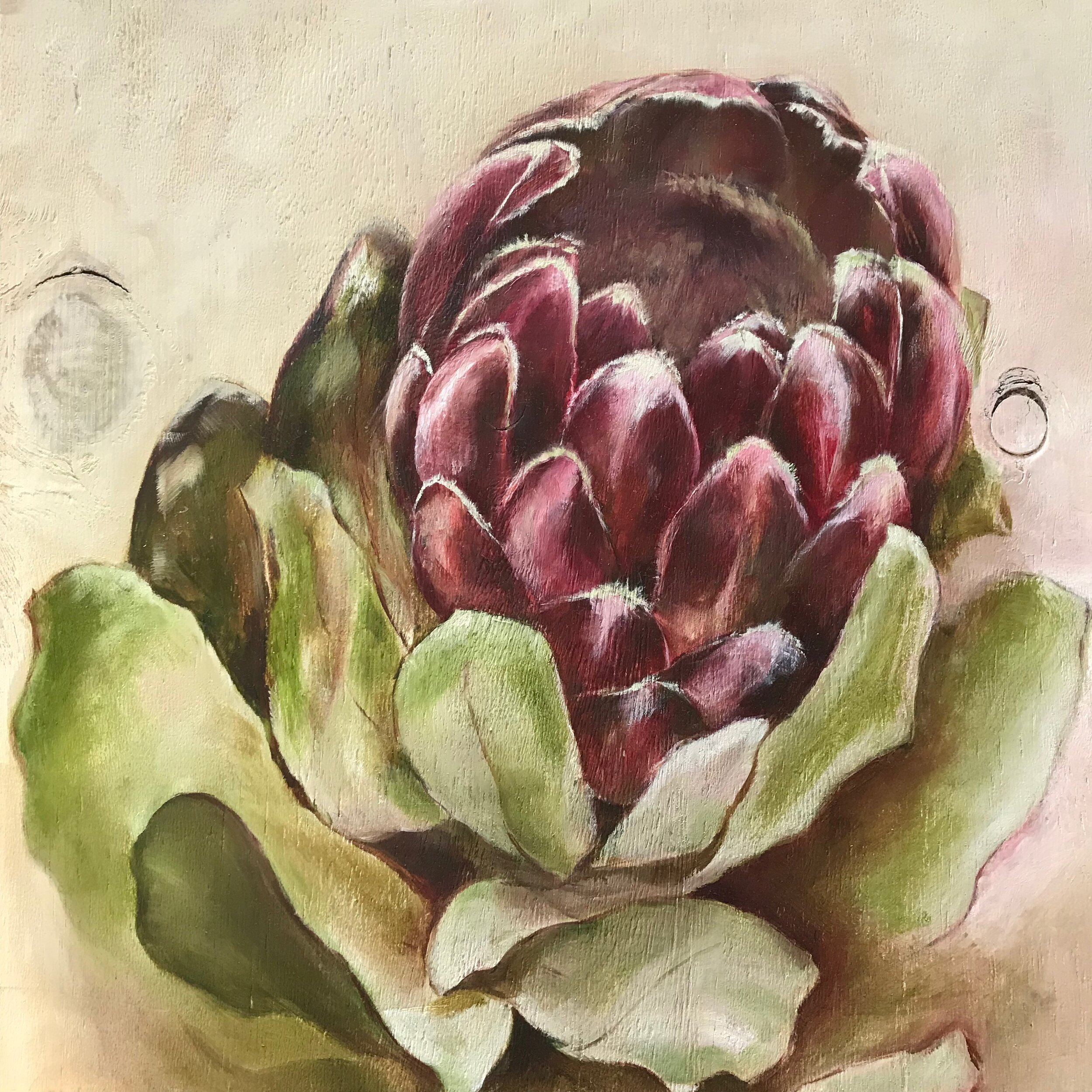
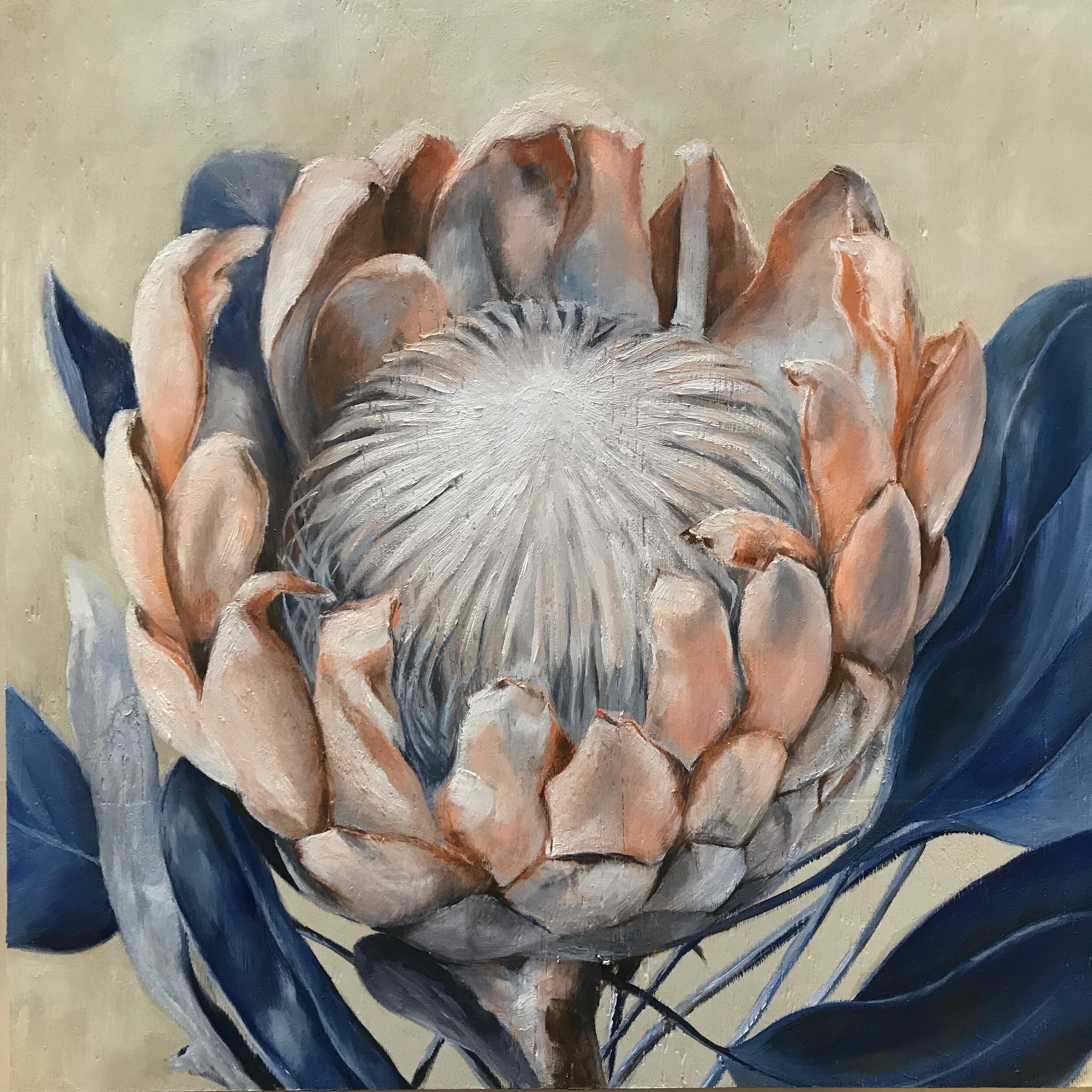
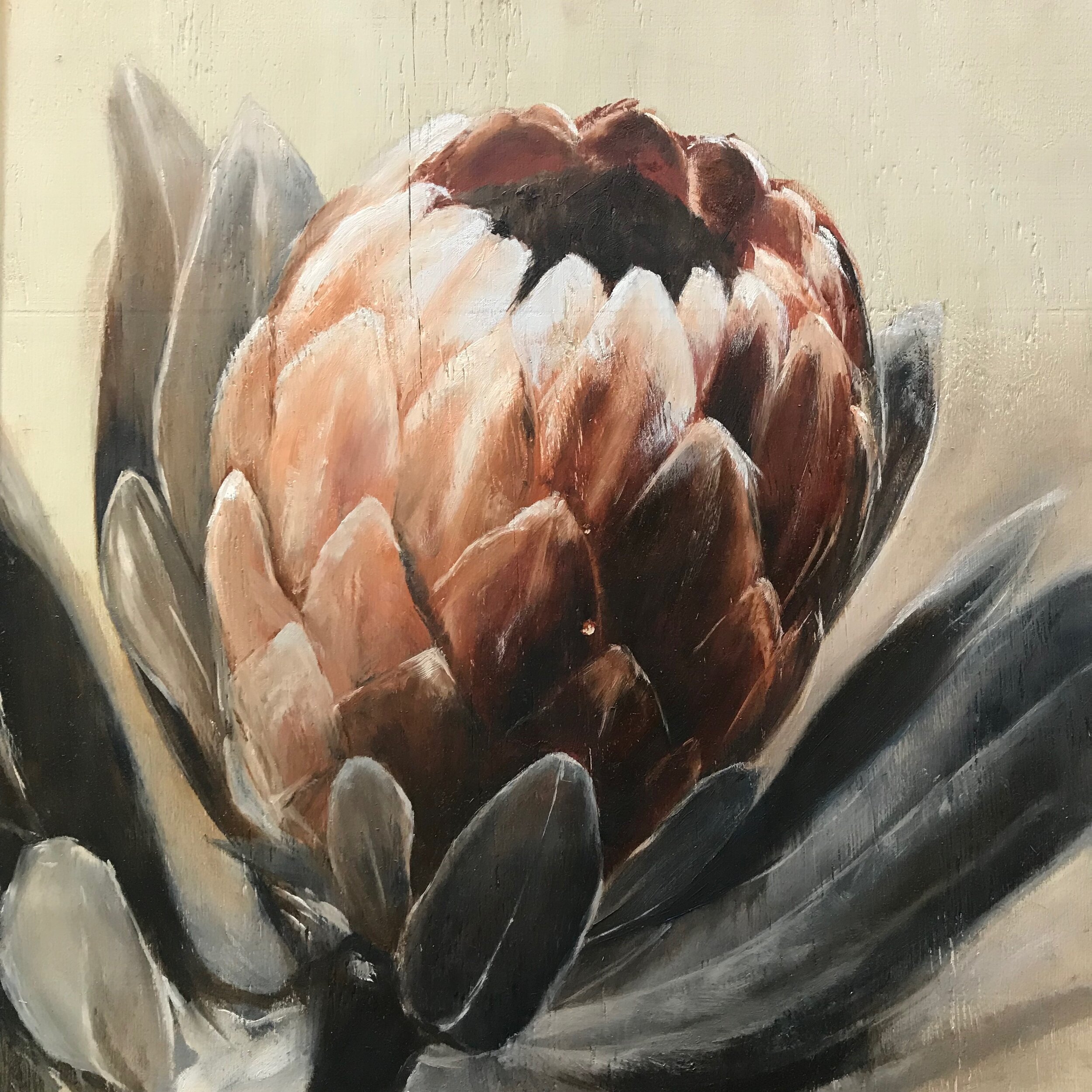
These Proteas painted by Natalie are a good example to show how colour has tonal value and if if you use them correctly you’ll see it easily when you convert your photo on your phone to monochrome. This is also a good tool to check if you’re still judging your colour correctly.

In this exercise, remember to only use one red and two greens or one green and two reds maximum. same with the other two complementary pairings. The reason is that if you cast the net too wide you catch all the colours again and remove the element of limitation. We learn most when we are limited!

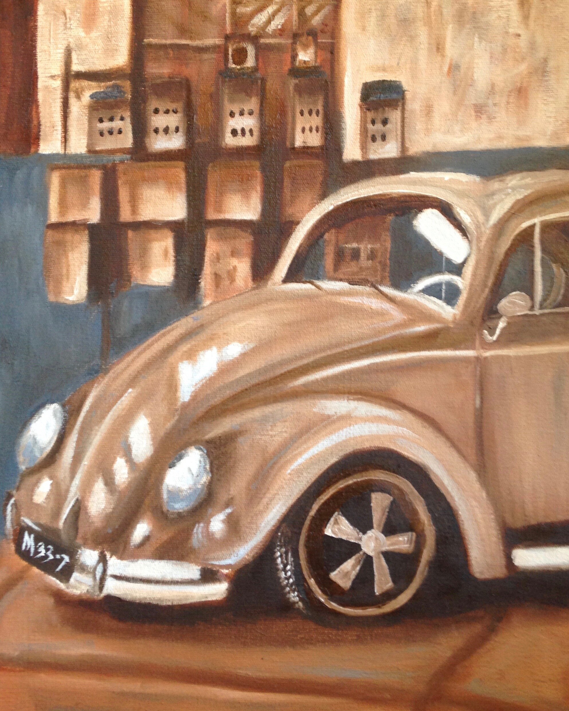
What I do like about Esté’s series is that she chose not to repeat an image but build one up as parts in this exercise.
There is so muchto learn from this exercise, I challenge you to try it!
(…and if you do, send images, I would love to see what you’ve done! )