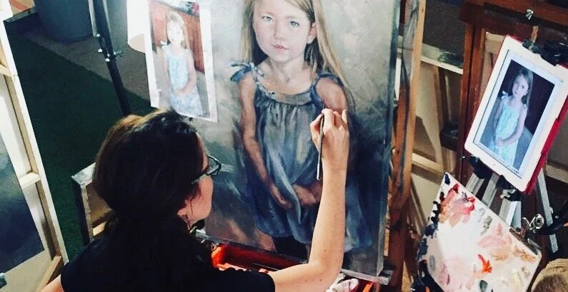
Your Primary school teacher lied to you!
The simple colour wheel she taught you doesn’t work.
Colour wheels are hotly debated and tweaked by each working artist’s practical preferences. Everyone’s aim is to make colour mixing easier but it can get confusing.

Knowing to which neighbour your primary colour tints towards is important as it will guide you to mix either bright or muted colours.
The no.1 thing to do, is to start noticing towards which secondary colour your ‘primary’ colour is slanting.
There are many terms for this: colour bias, double primaries, warm vs.cool, but the bottom line is that if you have two reds, two blues and two yellows, life becomes easier.
Standing in an Art Store, you’ve noticed that '‘primary colours” come in a variety of pigments. Each colour will slightly tint to one of its neighbours, this can be refered to as a warm tint or a cool tint.
We thus have 6 primary colours:
Violet Red - warm
Orange Red - cool
Orange Yellow - warm
Green Yellow - cool
Violet Blue - warm
Green Blue - cool
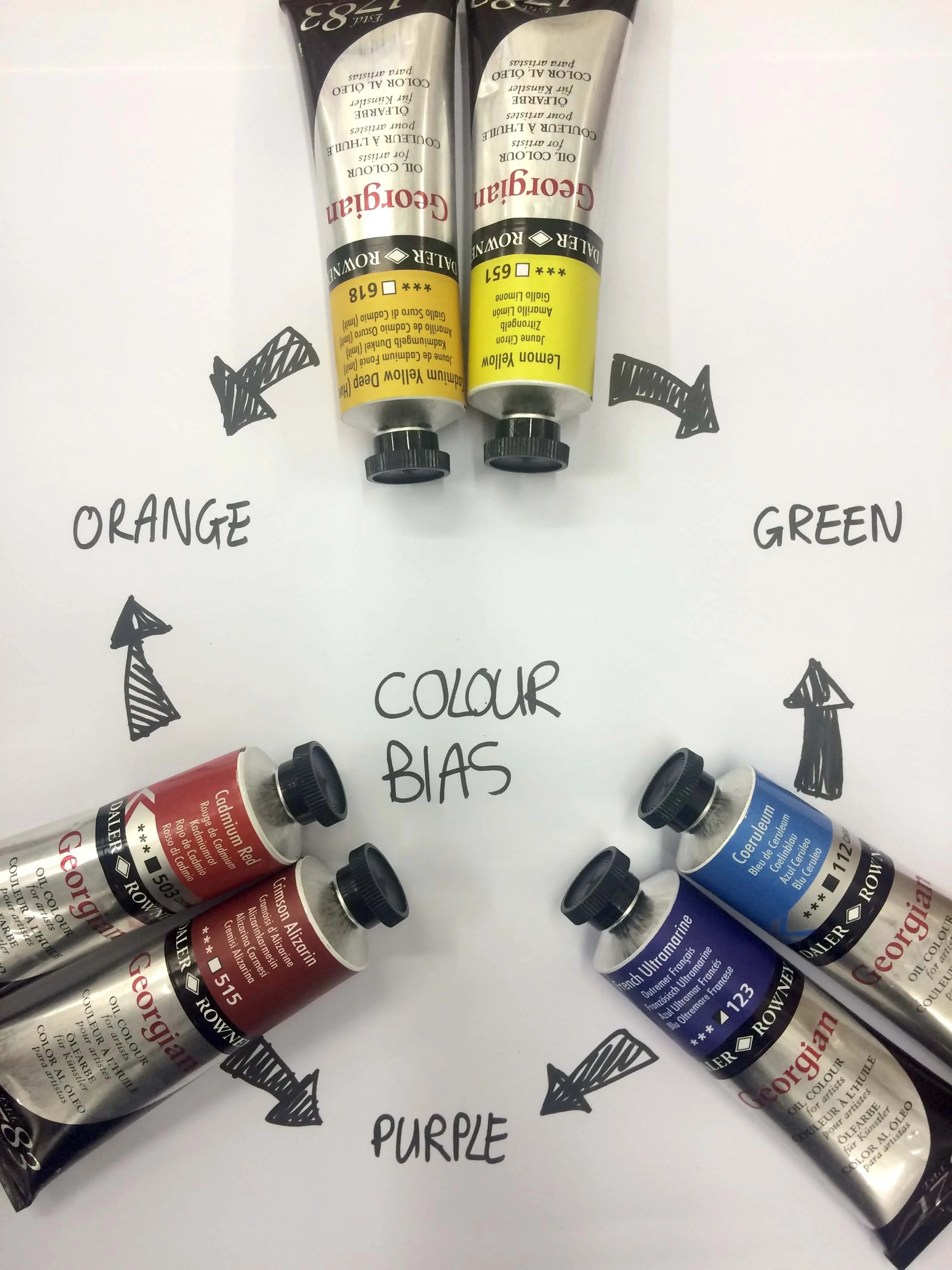
Double Primary Colour Wheel
The general colours* that most artists use are as follows:
Violet Red - warm - Crimson Alizarin
Orange Red - cool - Cadmium Red
Orange Yellow - warm - Cadmium Yellow Deep Hue
Green Yellow - cool - Lemon Yellow
Violet Blue - warm - French Ultramarine
Green Blue - cool - Cerulean
(*remember that artists preferences are as varied as their personalities!)
In practice French Ultramarine is a violet blue (warm), while Prussian Blue is a green blue(cold). Mixing each of them with another colour will have different results. To get the brightest mixture, you should choose colours which lean towards each other on the colour wheel. Thus a violet red and a violet blue will create the brightest purple. As each primary tint contains some of the colour it leans to - mixing an orange red with green blue to achieve a purple, would in fact mean that you would be combining 4 colours instead of two. The purple would now contain blue and red, but also orange and green. As orange and green are complementary to blue and red, they will add a grey/ brown "muddy" element to the purple.
Summary:
If you would like to mix the brightest secondary colour - mix the primary colours that are tinted towards that secondary colour.
If you want to mix a muted secondary colour - mix the primary colours that tint towards complementary colours.
In a good painting, you need both bright and muted colours.
Good colour Theory books I’ve read:
1. Michael Wilcox's book, Blue and Yellow don't make Green. This book was an eye opener and set me on the path to understanding colour bias. Here is a link to his youtube video explaining his colour system: The Michael Wilcox School of Colour Successful Colour Mixing Video - Part Two
2. Tony Paul's book, How to Mix and Use Colour.
3. Nita Leeland has a whole range of books on using colours which you can find here.
Good Youtube Videos to watch:
1. If your a beginner or working in acrylic , take a look at Chuck Black Art’s The ONLY Acrylic Colors You NEED!
“After trying numerous colors over the years, I've narrowed it down to just 10 colors that I need in my arsenal of acrylic paints. I show you everything you need to know and how to mix them!” Chuck Black
2. Dr Oto Kano gives a thorough explanation about the split primary palette. She works with watercolour and aims at bright colours:
Color Theory Ep. 2 | Split Primary Palette | What Is It? & How To Make One
In the second episode of our color theory series, we take a look at what is so good about the split primary palette, as well as hints and tips on how to put together your own split primary based palette.”
3. If you’re a high end oil painting purest, take a look at Paul Foxton’s The Limits of the Primary Palette
“A half hour video showing just how limited the blue-yellow-red "primary" palette is for artists.
I mix the extent of the range of colours you can get at a few problematic hues to demonstrate why a primary palette will hold you back more than it helps you.” Paul Foxton
4. And an extra quirky one from Scott Naismith: Colour Theory: The Truth About The Colour Wheel