• Paintings
  • portraits
  • mixed media
  • About
  • Contact
Menu

Anna-Carien Goosen

  • Paintings
  • portraits
  • mixed media
  • About
  • Contact
Anna-carien Goosen _creativity jpeg

What if I'm not creative enough?

September 18, 2020


What an absurd question when the hallmark of humankind is creativity!

Creativity is just a muscle that needs to be exercised. It was built into us so that we can survive difficult times, and 2020 certainly calls for creative fitness!

Debunking myths and defining creativity:

IMG_8338.jpeg
  1. It’s not magic, it’s just a skill, and like most things in life, anyone can improve at if they give it the time and effort. Draw understanding of the world around you, connect those observations to your existing knowledge reservoirs, and imagine new applications of your knowledge on the world.

  2. Doing is key to creativity, not just dreaming. If you’re imagining a series of artworks, don’t talk about it, paint them. If it’s an idea, go out and do the research to prove it. If it’s a new process, try and test it to see if it works. If it’s an object, build it.

3.If you think you are creative, you’re more likely to actually be creative. Acting and thinking differently actually makes you different: ‘ Neurons that fire together, wire together’. According to Harvard Business Review research, anyone can innovate, if  they choose to. It’s done by choice, not chance.

Above is the quilt I made when I turned 40, it celebrates finding beauty in fragmented body parts (because it’s all down hill from here!)

Above is the quilt I made when I turned 40, it celebrates finding beauty in fragmented body parts (because it’s all down hill from here!)

3. Creativity is not ‘Originality’. This is a useless word that trips people up, so ditch it from your vocabulary!

 ‘I don’t believe in originality. It is just one more fetish made up in our time, which is speeding dizzily to its collapse. I believe in personality reached through any language, any form, any creative means used by the artist. But out-and-out originality is a modern invention and an electoral fraud.’

Pablo Neruda

The above series of Momento Mori portraits were an experiment in alternative materials, I used cut up pieces of evening gown net that reminded me of death shrouds. An unusual drawing medium but it added to the content

The above series of Momento Mori portraits were an experiment in alternative materials, I used cut up pieces of evening gown net that reminded me of death shrouds. An unusual drawing medium but it added to the content

4. Focus on connecting networks, not labelling your self a left or right brained person. Yes, different parts of the brain have different functions, but many say that ‘the left brain as the creative side’ vs. ‘the right brain as the analytical side’ is pseudoscience. When it comes to creativity, neuroscientists have identified three large-scale networks.

·  The executive attention network helps you pay attention and focus

·  The imagination network allows you to daydream or imagine yourself in someone else’s shoes

·  The salience network that let’s you identify when things you have buried deep in your brain are salient to the world around you

The more active these networks are in your brain, and the more they work together, the more creative you are. As Steve Jobs explained;

“Creativity is just connecting things. When you ask creative people how they did something, they feel a little guilty because they didn’t really do it, they just saw something.”

5 ways to flex your creativity muscles

1.     Schedule it like exercise! Make room for practicing creativity on your own or join some kind class. Try something outside of your creativity comfort zone. If you’re already creative in one field, try another one! Switching tasks has been shown to increase creativity—and when you’re switching between inherently creative tasks, it’s an even greater benefit. Changing things up allows you to make unexpected connections between your knowledge banks and the new environment.

IMG_2774.jpg
IMG_0087.jpg
IMG_0116.jpeg
IMG_0094.jpg

2.     Be bored, it leads to daydreaming, which activates your brain’s imagination network. Studies show that being bored enough to daydream, sparks creative thinking and generates ideas. The first time I went plein-air drawing in the Aussie bush, I was shocked by my temptation to add extra stimuli from music or podcasts instead of just becoming still and open in quiet contemplation.

3.     Going for a walk (especially outdoors) is one of the best things you can do to boost your creativity and encourage new ways of thinking. It’s been shown to increase creative output by up to 60%. Get your earphones and listen to “happy music,” which research also shows facilitates divergent thinking and delivers a potent boost to creativity.

4.    Keep a journal. Pay attention to, and record new ideas that come to you. When an idea, or even a small component of an idea, comes to you, start making it a point to preserve it. “Capture now, evaluate later”. Like a snowball, one idea often leads to another. If the idea isn't appropriate for your current work, set it aside to work on later or implement it in a future project. Research has shown over and over again that capturing your new ideas is likely the most valuable aspect of boosting creativity.

IMG_6559.jpg

5.     If you’re trying to get “unstuck” on a project…try approaching the project at an unexpected time. Usually we tackle analytical problems when we’re at our peak level of attention and focus, but more creative problems actually benefit from a more relaxed mind. A recent study found that you’re more likely to solve “insight problems” when you are least alert because thinking creatively requires different areas of the brain.

Creativity is available to everyone and is there to help us live in possibility and abundance rather than limitation and scarcity. Don’t waste time questioning your creative ability, rather get creatively fit!

Go out, get curious, get bored


1 Comment
Anna-Carien Goosen.jpeg

Colors are friends with their neighbors and the lovers of their opposites.

July 28, 2020

“All colors are the friends of their neighbors and the lovers of their opposites.”

Using colours effectively can lift a mediocre painting to new heights. The above quote is a crucial key to gaining a working knowledge of colour. Colour is relative and strongly influenced by its surroundings. You need to know which colours work most effectively next to each other.

Read More
1 Comment
Anna-Carien jpeg

How to use the Double Primary Colour Wheel

April 24, 2020

Your Primary school teacher lied to you!

The simple colour wheel she taught you doesn’t work. Colour wheels are hotly debated and tweaked by each working artist’s practical preferences. Everyone’s aim is to make colour mixing easier but it can get confusing.

The no.1 thing to do, is to start noticing towards which secondary colour your ‘primary’ colour is slanting.

Read More
In Working with Paint, Working with Colour Tags double primary colours, oil paint, paint, complementary colour, what to buy
1 Comment
Threshold

Glazing, an undervalued technique for oil and acrylic paintings

September 4, 2017

Ever wonder why some oil paintings really 'pop' while yours just wont? Try glazing.

Glazing is a technique used within painting where transparent layers of paint are layered upon earlier layers of (usually opaque) paint that have already dried. Glazing is an amazing technique used within oil painting and understanding and using glazing effectively will really give you that "oil painting" feeling. When glazing an oil painting it is possible to give your painting a feeling of luminosity that is impossible to achieve otherwise. Glazing was also used by the old masters to create colours that were hard to find or impossibly expensive, for example, blue can be glazed over an underpainting of a red gown to create a royal purple garment.

Just a note, if you haven't read my post on whites and on how to read paint labels perhaps do so first, as it will make the following technical terms easier to understand.

Let's start by discussing mediums and pigments:

A medium is usually a mixture of solvent and oil, kept separate from your oil paint and mixed in when needed to give the paint the desired consistency. Usually this translates to a 50/50 mixture of linseed oil and artists turpentine. There are however a multitude of recipes. Some good guidelines however are to never use more than 50% solvent (turps - as it will literally dissolve the pigments in your paint) and to never use vegetable oil but to keep to refined oils such as linseed, poppy seed, walnut and spike oil, which tend to yellow less over time than others. Another tip is to never use Damar Varnish in your medium, if the painting is ever restored, or even if you would want to rework the painting, you'd have to strip down the varnish and so doing disintegrate the painting.

All mediums are considered to be "fat", while opaque pigments without medium are considered "lean". Fat is always over lean. When starting a painting it is crucially important to have a lean opaque underpainting, adding in more medium as you approach the top most layers. Adding lean over fat, instead of fat over lean will result in cracking as topmost layers will dry before bottom layers. Adding in more medium on top of leaner layers will also result in your oil soaking through the lean layers, which is a good thing.

Here are a few recipes for mediums which I found on Art Babel  

Easy Formula: 1/2 Refined Linseed oil, 1/2 Turpentine (vary quantities according to viscosity that you want) This is pretty quick drying and good for sketching and painting fast. However, it's not great for layers of delicate color - too much solvent. 2/3 oil, 1/3 solvent is much better for that purpose.

Vincent Desiderio's formula: 1/3 Venetian Turpentine, 1/3 Sun-thickened Linseed Oil, 1/3 turpentine

Adrian Gottlieb (which he says was taught to him by "Scott" at Charles Cecil's Studio): 1/2 Sun-thickened walnut oil, 1/4 Canadian Balsam, 1/4 Turpentine

When glazing, instead of just adding small quantities of medium to your paint, you will deliberately either add pure colour to a small pot of medium or mix in a lot of medium with your paint on your palette to create a very runny paint. This is then applied over any dry underpainting that you already have. Depending on what colours you add to your medium to make a glaze, the effects will vary greatly. Glazing is a great tool to manipulate the warm and cool areas of your painting. Generally speaking, diluting a transparent pigment with a medium will result in a warmer glaze and is called a Traditional Glaze. When using a colour that is lighter than the underlayer and is only semi-transparent, the glaze will cool the painting and is called a Velatura. This type of glaze usually contains white. 

Pigments, is what your paint is made from. To be able to glaze effectively it is important to know if the pigment you are using is transparent, semi-transparent or opaque, and also how strong the pigment is. It is also important to use a high quality paint for glazing, as many cheaper paints do not have the high transparency levels that their more expensive counterparts do. Sap Green is a great example of this. 

Maimeri Puro, Avignon Orange & Sennelier Indigo Hue

Maimeri Puro, Avignon Orange & Sennelier Indigo Hue

The following handy list, which I also found on Art Babel, describes the effects that different colours will have when glazing a painting with them.

Indian Yellow — warm yellow makes painting look lit by sunlight

Transparent Orange — warm orange

Perylene Red — cool red with yellow undertone

Quinacridone Red — cool red replacement for Alizarin and makes high key tints

Quinacridone Magenta — cooler high key red

Quinacridone Violet — clean, warm violet

Dioxazine Purple — cold purple that can be used for a black

Manganese Blue Hue — cool (leans toward green) transparent blue

Phthalo Blue — 20th century replacement for Prussian Blue (also slightly greenish)

Phthalo Green — cold, dark green with great transparency and tinting strength

Phthalo Emerald — warmer, more natural looking Phthalo Green

Here is an example I recently did:

Glazing is not a once off process but a continual journey of watching what the glaze does, and then finding out if it should be partially ( or completely!) wiped off, or if it needs a thicker glaze, or perhaps deciding that another colour would work better.

Remember that any transparent or semitransparent colour can be used, and in the end it is important to experiment (and fail!) to be able to know what works best for you and the effect that you would like to create on each unique painting.


2 Comments
I'm standing infront of a painting by Collin Chillag at the MEAM museum in Barcelona. I love the way Chillag playfully mixes his colours ontop of his paintings and makes mini colour charts for each work.

I'm standing infront of a painting by Collin Chillag at the MEAM museum in Barcelona. I love the way Chillag playfully mixes his colours ontop of his paintings and makes mini colour charts for each work.

Make your own Colour Charts!

May 17, 2017

Moving from drawing to painting usually means an explosion of colour for the amateur painter. While this is often exciting, it can also result in a lot of "mud" on your canvas. This post seeks to equip the artist with the skills needed to be able to work well with colour

Read More
1 Comment
Anna-Carien Goosen Portraits Mother-In-Law

Black AND OTHER DARKS

March 10, 2017

“White may be said to represent light, without which no colour can be seen; yellow the earth; green, water; blue, air; red, fire; and black – black is for total darkness.”

-          Leonardo da Vinci

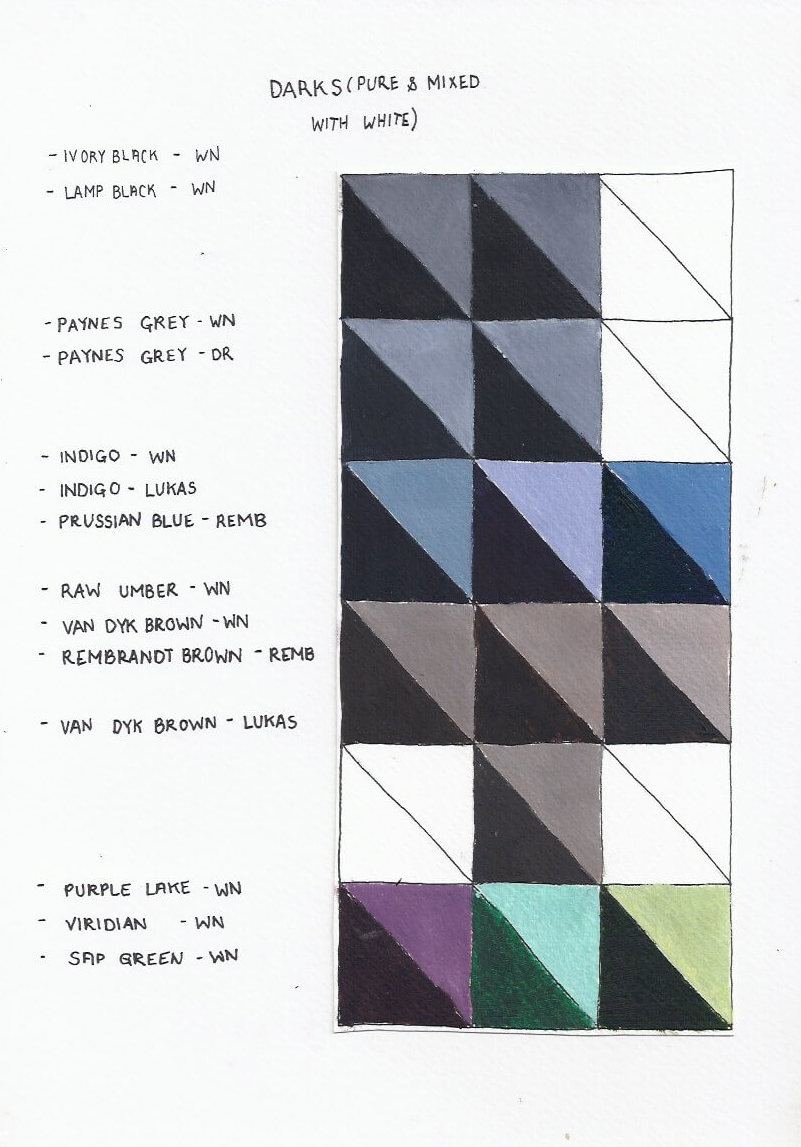
Dark_paints_and_undertones

Black is often seen as a 'no-no' within oil painting, or at least as a colour that should be used sparingly. However as with any colour or tube of paint, its all about understanding the underlying pigment and what its' most effective use is. 

Gregory Manchess, in a blog entitled 10 things... About Painting in Oil , describes this quite well,

“Yes. Use black. Black exists in Nature, much to the chagrin of quite a few instructors. You just don’t want to use it to grey colors for skin tones, shadows, etc. Then you really will get muddy. If you want to make black exciting, mix other transparent colors into it. You’ll get a fabulous range of blacks. But you have to learn to use black. You learn through patience and practice. Look for places to use it judiciously.”

For the artist, an understanding of the correct use of black is vital, especially as black often leads to a dead or dull area within a painting. For the Old Masters however, black and other darks covered large parts of their final works.

The Man with the Golden Helmet, Rembrandt, 1650, Oil on Canvas

The Man with the Golden Helmet, Rembrandt, 1650, Oil on Canvas

As with other colours and pigments one will find various names and types of blacks on manufacturers’ products.  This can describe how it was made or represent its history.  This history will determine what the specific paint brings to the canvas.

Ivory Black

Ivory Black is historically also known as Bone Black, and was originally made by the Romans who burned bones to gain access to this pigment. Later on, as better pigments became more sought after, pure Ivory was used instead of bones. True Ivory Black is more intense and has a higher carbon content than Bone Black. Examples of Ivory Black can be found in the deep velvety backgrounds of Rembrandt's paintings. Ivory Black can still be purchased, in very small quantities, at a costly price. However, the ivory used is harvested from animals that naturally pass away. Here's a link to buying bone black pigment. It is important to note that both pigments are slow drying within oil and should never be used in an underpainting. The pigment is also soft and brittle when used as oil paint. Also note that these pigments are considered to be toxic.

Mars Black

Originates from the mineral Iron oxide. The name Mars was deducted from Mars being the alchemical name for iron. Mars black was developed in the early 20th century and is the only black pigment that is considered non-toxic. It also dries successfully, which immediately sets Mars Black apart from the other blacks available, and can thus be used in underpainting. It is considered to be a hard flexible oil pigment, as well as dense and opaque with a warm brown undertone.

Lamp Black 

“…Grind it for a year it would be blacker and better”, Cennino d'Andrea Cennini wrote concerning what he considered to be the “perfect” black - Lamp Black. In essence it is the soot-residue left over from burning oils and mixed into paint, thought to originate from the development of lamps. Originally Lamp Black was made from burning vegetable oils, nowadays tar, creosote, naphthalene, or other petroleum products are burnt to produce this pigment. Lamp Black can be found in all Egyptian murals and tomb decorations. It is however very slow drying, and should not be used on an underpainting. It is also a soft and brittle oil colour. Although lamp black was one of the first and most used blacks, the superiority of Mars Black makes Lamp Black a poor option.

Payne’s Grey 

Payne's grey is a dark blue-grey colour used in painting. It is often used as a darkener in place of black. Payne's Grey was originally a mixture of iron blue, yellow ochre and crimson lake, Payne's grey now is often a mixture of blue (ultramarine or phthalocyanine) and black or of ultramarine and Sienna. The colour is named after William Payne, who painted watercolours in the late 18th century. The first recorded use of Payne’s grey as a colour name in English was in 1835.

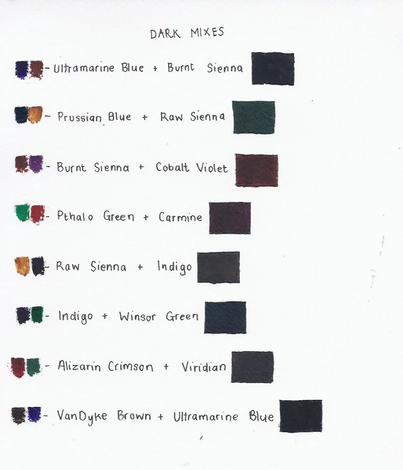
Mixes_for_dark_colours

As in everything: Experience will lead you towards the best choices for your project.

An artist can choose to have black on his palette or it can be mixed from other colours.  The easiest recipe is to mix the primary colours, but other colours can also be mixed to create interesting darks with vibrant undertones.

Within the studio, I prefer not to use too much black as it often "deadens" areas on a canvas. I like to use Indigo or Raw Umber to add a dark area within a painting. Payne's Grey can also be used successfully. 

Black, or any dark colour or mix is useful:

As a darkener to create a multitude of shades

As a creator of grey tints along with white

As an ideal pigment in brush drawing (especially in this case pure black)

In bringing character to paintings as each type of black brings with it different effects.


I hope this information inspires you to play a bit with the 'dark side'!


4 Comments
The Signifying Power of Absence, Oil on Canvas, Anna-Carien Goosen

The Signifying Power of Absence, Oil on Canvas, Anna-Carien Goosen

White? Not Quite.

December 2, 2016

The array of whites available can quickly become confusing! This post shares information about various whites and what you need to keep in mind when choosing whites. it also includes links to other sites if you want to get more technical information and see photos of experiments in white. 

Read More
In Working with Paint Tags white, oil paint, paint
1 Comment
Between Fact and Fiction.jpg

How to read the labels on your new paint

September 22, 2016

Take the time to know your gear. An artist should be "paint literate" in terms of not only being able to recall paint by its name but also understanding the ingredients used and the differences between each.

Read More
In Working with Colour Tags oil paint, paint, double primary colours, transparency, opaque
4 Comments
Historically, a lot of artist materials are quite poisonous. 

Historically, a lot of artist materials are quite poisonous. 

Strange stories hidden in your paint box

September 7, 2016

Living in today's fast paced world of quick fixes and insta-gratification we hardly stop to think of the history of the objects we use, and the many sacrifices that have been made to provide us with utter convenience. Oil Paint, especially, has a dark and grim history. Preparing and grinding pigments for paint was not only a laborious task for any painter (If you've seen the movie Girl with the Pearl Earring you should recall this), but also toxic, gross and often involved animal cruelty.

Read More
In Working with Colour Tags paint, oil paint, colour history
2 Comments

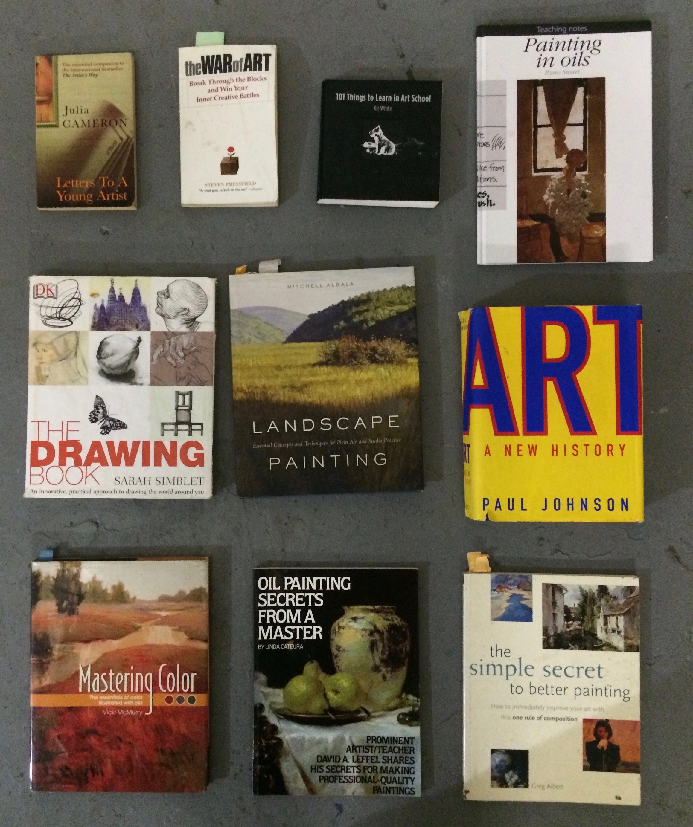
My 10 most read art books

August 1, 2016

These are books that I've read over and over..... and over...

Read More
In Working with Paint, Working with Colour Tags what to buy, books, paint
Comment
Anna-Carien Goosen

Making my own Sculptural Jewelry

July 30, 2016

A woman can always find space for more jewellery!

I majored in painting, so sculpture is  a hobby that provides a wonderful excuse to play with power tools. It is a very masculine discipline and I' m still learning and experimenting. 

Read More
Comment
Nougat doesn't really care for etiquette...

Nougat doesn't really care for etiquette...

OIL Paint ETIQUETTE: I BOUGHT SOME PAINT - WHAT NOW?

June 23, 2016

Romantic ideas of the depressed artist painting into the early hours of the morning are often accompanied by an overwhelming olfactory sensation, of turpentine. Fortunately, the wonders of linseed oil and baby oil have been discovered. This is what my basic set-up for oil painting looks like:

Read More
In Working with Paint Tags what to buy, oil paint
1 Comment
The Truth, first version  3.jpg

FOR THE FRIENDS WHO TEXT ME IN ART SHOPS ASKING; "WHAT PAINT MUST I BUY?" Part two: Oil Paint

June 7, 2016

For those of us who are tempted by positively everything within an art store, investing in a new medium can be a daunting task ( of trying not to buy everything - and still keeping within the budget).

Read More
In Working with Paint Tags double primary colours, paint, oil paint, what to buy, earth colours, white
2 Comments
IMG_0366.jpg

For the friends who text me in art shops asking; "What paint must I buy?". Part One: Acrylics

May 7, 2016

Keep in mind firstly, that this is my colour choice (and all artists have different preferences even though they use the same basic colour principles), and then secondly that this post is more relevant for South-Africans living close to Jimnettes Art Shop

Read More
In Working with Paint Tags paint, what to buy, acrylic paint, double primary colours, earth colours, white
2 Comments

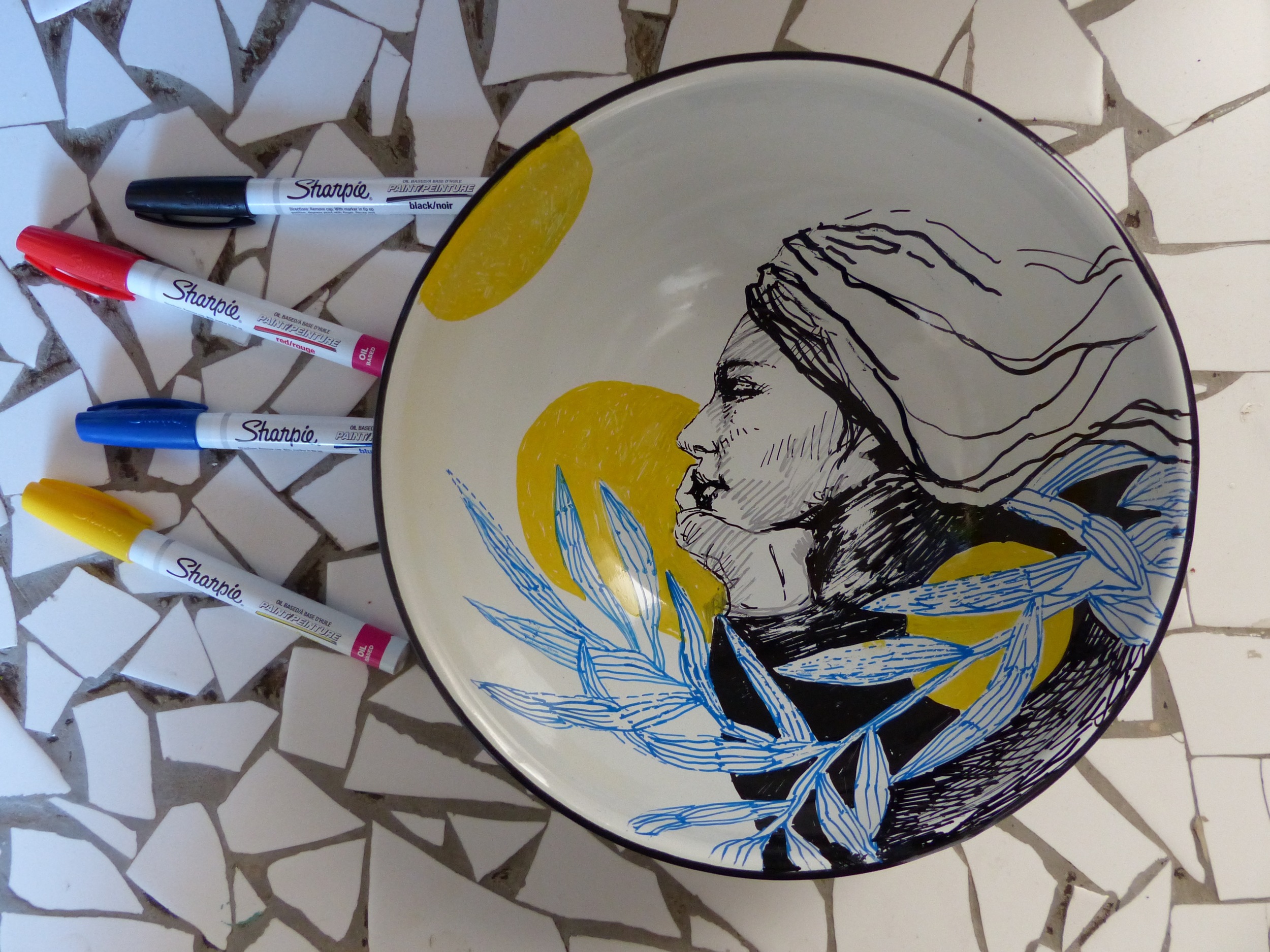
An easy family art project (and a creative way to make meals fun!)

April 7, 2016

How to individualise ceramic plates with Sharpies so that you can ‘play' with your food at dinner time…

Read More
In Creative Family Tags Sharpies, Ceramic plates, Creative dinner
1 Comment
Anna-Carien Goosen

How to chose the right under layer colour for a painting

March 10, 2016

Recently I received a brief to paint for a client who loves very specific colours. I visited his home, taking note of the mood and colours thereof,  but when I starting painting, I realised the overall feeling is going to be too 'cold' and decided to put down a wild, expressive, complementary colour layer down first...

Read More
In Working with Colour Tags cold colours, complementary colour, under layer, colour experiment, acrylic paint, paint
1 Comment
Anna-Carien.jpeg

These blog posts are made for my students. This is where I store my own teaching advice and that of other instructors I’ve found interesting. A broad ‘art diet’ is always more healthy! Enjoy!

Subscribe

Sign up with your email address to receive my news letter with free art tips, 'work in progress' shots and updates on workshops and exhibitions

We respect your privacy.

Thank you!

“Everyday I discover more and more beautiful things, it’s enough to drive one mad. I have such a desire to do everything, my head is spinning with it.”

Claude Monet


.

Powered by Squarespace